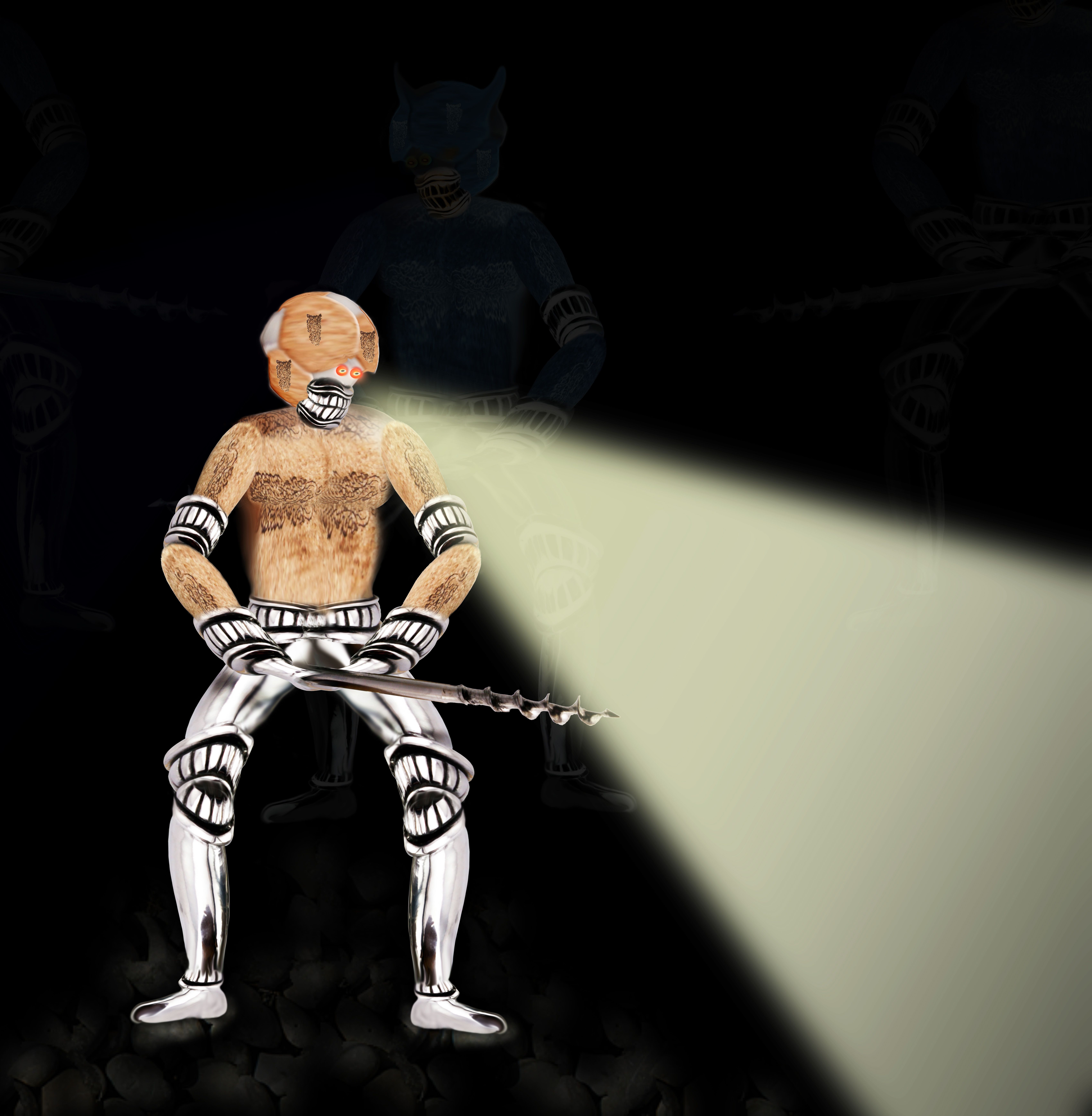
I used only the source image and PS.
Edit: Removed some debris from the picture. (5 years and 3778 days ago)
Attack of the Mole Men 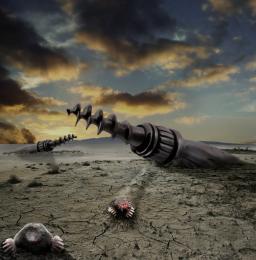 by CMYK46 15572 views - final score: 64.1% | Voyage to the Cork Nebula  by pearlie 12783 views - final score: 60.9% | Waiting..............  by swordfish 11899 views - final score: 58.7% |
Battlefield...Nobody survives  by hereisanoop 12234 views - final score: 58.7% | hi-tech 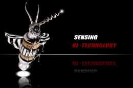 by closedeyes 9187 views - final score: 58.6% | The Venus of Willendorf 2010 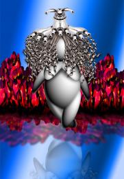 by Drivenslush 7673 views - final score: 58% |
Best with Cheese 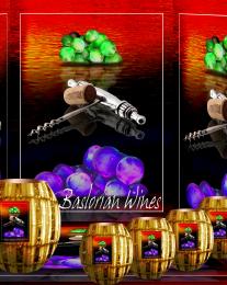 by Drivenslush 6111 views - final score: 55% | Slight Accident  by Martrex 5816 views - final score: 54.6% | Where are they? 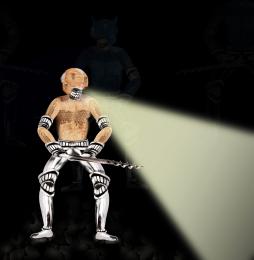 by shaiju1974 4958 views - final score: 53.8% |
pouring wine 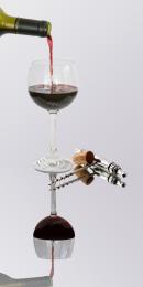 by friiskiwi 6822 views - final score: 52.4% | Leaning Tower of Purple Pisa 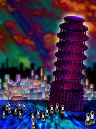 by Drivenslush 8048 views - final score: 52.2% | Spare Pawns 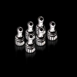 by lydyth 7323 views - final score: 51.5% |
Aouch  by sunzet 3777 views - final score: 51% | Let us live! (updated)  by erikuri 4471 views - final score: 50.6% | Arcane  by trum 3916 views - final score: 47.5% |
Howdie Guest!
You need to be logged in to rate this entry and participate in the contests!
LOGIN HERE or REGISTER FOR FREE
Photography and photoshop contests
We are a community of people with
a passion for photography, graphics and art in general.
Every day new photoshop
and photography contests are posted to compete in. We also have one weekly drawing contest
and one weekly 3D contest!
Participation is 100% free!
Just
register and get
started!
Good luck!
© 2015 Pxleyes.com. All rights reserved.


Thanks for your comments! I will change it
Good Concept...but i think if the light coming from eye, it should be redish or is it the teeth relection..anyway good work.
work on the background try to give a realistic standing posture by shading and shadows.. in the background.... now it looks seperate from the background... and some more suggestions... I saw the high resolution... the arm pads does not have fine edges.. its been erased away... look at it. Good luck.
good job... but the the body half instead of head is looks like the same half copy.. seems like no hard work here...
Howdie stranger!
If you want to rate this picture or participate in this contest, just:
LOGIN HERE or REGISTER FOR FREE