
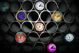
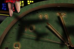
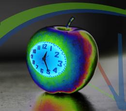
1. cut clock hands from source image.
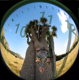
2. pipe image
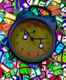
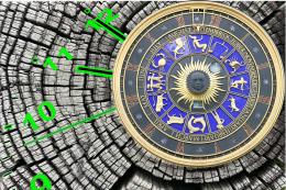
3. 3 x clock images
4. replaced hands of black clock with material from hands source image.
5. positioned clocks
6. blended adding drop shadow, gradient layer, and bevel to alter appearance of some of the clocks.
7. merged, poster edges and lighting.
Big Thank You to MorgueFiles for Images (5 years and 3775 days ago)
- 1: background layer
- 2: clock
- 3: clock
- 4: clock











Haha, this is like the lamest and most minimal use of source ever. Sorry, but it is, you just took the clock hands, which are the least important part of your image..... =/
Whatever... It's nice!
very nice work...great finall result...post SBS to show us where did u use source image...
It does seem a little minimal but the idea and the execution is nice. SBS would be nice. Wlado, I've see worse GL!
I am adding the most minimal sbs ever, only to show my use of source image, for which I make no apologies. When I found the image of the pipes I wanted to use it, and I have.
Nice work....
Howdie stranger!
If you want to rate this picture or participate in this contest, just:
LOGIN HERE or REGISTER FOR FREE