
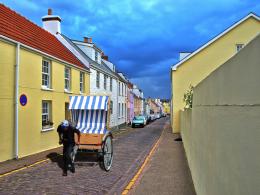
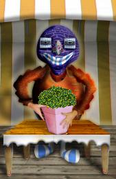
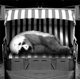
I had to make a little change to the field I had used before because i misunderstood the rules of the image.
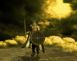
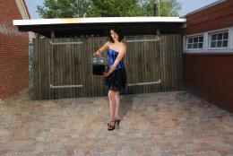
Credits to:
Marcus Ranum - http://mjranum-stock.deviantart.com/
theflickerees-stock - http://theflickerees-stock.deviantart.com/ (5 years and 3698 days ago)


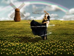
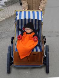
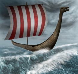
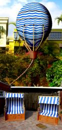
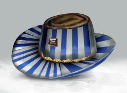
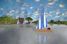

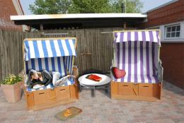


The best one in this contest so far. The use of source is very good. I like the composition and the colors. I have some suggestions, maybe they can help. The rainbow colors can be better if you compare it to the real one, this one is easy to be fixed, also it should be behind everything in this scenery, including the trees (do you know that without water in the air, we can't see the rainbow?). I prefer the ribbon to be softer and glowed a bit more, that would be nice. Wish you the best of luck!
Creative use of source author, to me the colours are a bit too bright, maybe experiment with a bit of desaturation? But that's just me. Good job otherwise.
Edit: Great work on the windmill and the flowers!! They look so real... wow!
nice work
Very nice work...good luck author
Simply beautiful!
lots of fun
Thanks to all for the comments and suggestions.
better than the others.. GL!
exellent very welldone.....
Decent job
Nice 1 GL!
Amazing!
Congrats for your third place, Fatz!
Great entry, should be proud of your place!
Congrats!!
Congrats!!
Howdie stranger!
If you want to rate this picture or participate in this contest, just:
LOGIN HERE or REGISTER FOR FREE