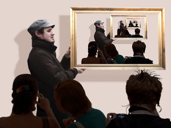
At an art gallery...
It's so difficult to resize 'til that small pic... Hope you enjoy! ;)
Thanks to Sterte at Flickr. (5 years and 3766 days ago)
A man, a man,a man  by kathyw 25461 views - final score: 63.4% | Thinking man  by langstrum 24174 views - final score: 61.9% | Aw Nuts!  by gamemastertips 29311 views - final score: 61% |
Crazy Blossoms 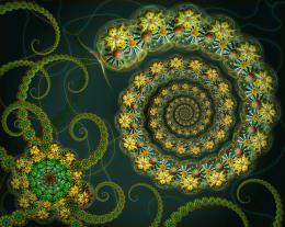 by CorneliaMladenova 20027 views - final score: 59.9% | Kids 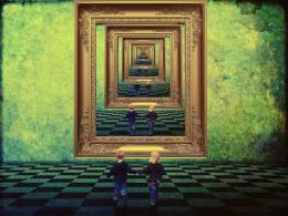 by vinji 20359 views - final score: 59.3% | The ultimate fighting 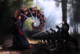 by langstrum 7506 views - final score: 59.2% |
Fingerhand 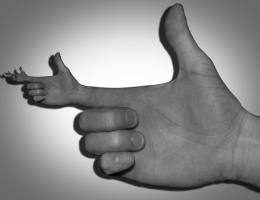 by jawshoewhah 4903 views - final score: 58.1% | painting 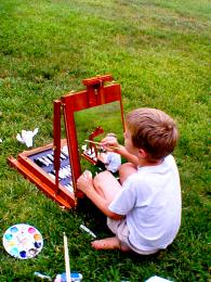 by snshnangel04 6848 views - final score: 57.9% | YELLING 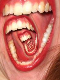 by cterraza 7392 views - final score: 57.7% |
Stuck inside 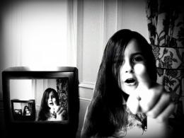 by bjaockx 7133 views - final score: 57.7% | Yum Yum! 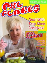 by Geexman 6168 views - final score: 57.2% | TV 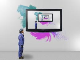 by vinji 5529 views - final score: 57.1% |
Twirl Desert 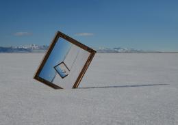 by hetsumani 7513 views - final score: 57% | Painting 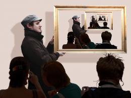 by erikuri 4785 views - final score: 56.7% | Circle of Light 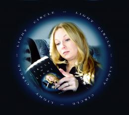 by artgirl1935 7122 views - final score: 55.8% |
Infinity 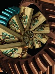 by vertigo 7059 views - final score: 55.7% | Untitled 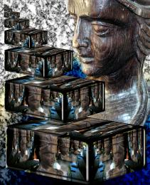 by Drivenslush 5366 views - final score: 55.3% | Learning about droste effect 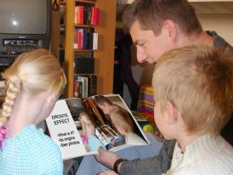 by erikuri 10300 views - final score: 55% |
Chronograph 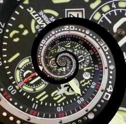 by filantrop 5515 views - final score: 54.8% | Inside a mirror 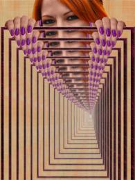 by erikuri 11284 views - final score: 54.2% | Gallery 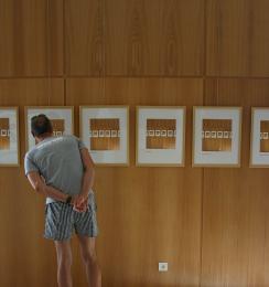 by Shamath 5659 views - final score: 53.7% |
eye within eye 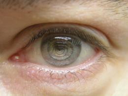 by torzonhot 10376 views - final score: 53.2% | Big Screen 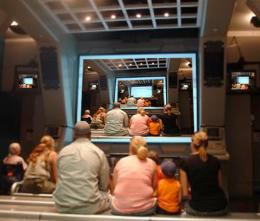 by DaniCMe 9239 views - final score: 52.3% | Mouths 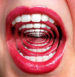 by Alan2641 10207 views - final score: 52% |
Lion Car-touche with Hibiscus 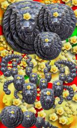 by Drivenslush 7417 views - final score: 51.9% | i want to go home 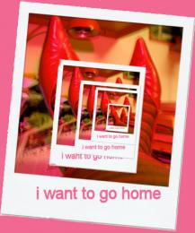 by SHIPLEYGIRL 4440 views - final score: 51.8% | Eyed 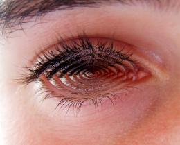 by jawshoewhah 4173 views - final score: 51.5% |
Photoshop 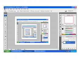 by Lamantine 3757 views - final score: 51% | Extra Bling !!!! 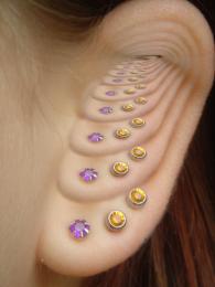 by Alan2641 5246 views - final score: 50.4% | Listen Closely 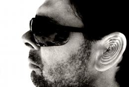 by Alan2641 5164 views - final score: 50.1% |
fire station 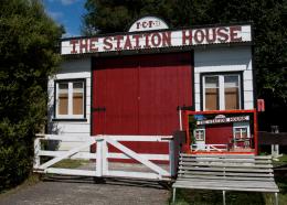 by friiskiwi 5260 views - final score: 49.9% | Write What You Know 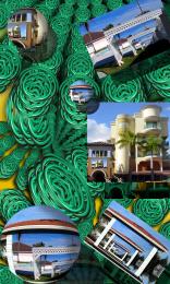 by Drivenslush 5972 views - final score: 48.9% | way too simple 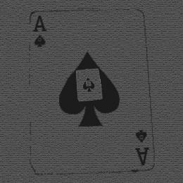 by tonmoyhabiba 5588 views - final score: 47% |
square  by SHIPLEYGIRL 4461 views - final score: 45.1% |
Howdie Guest!
You need to be logged in to rate this entry and participate in the contests!
LOGIN HERE or REGISTER FOR FREE
Clever one! The crowd just looks a little overshadowed and perhaps a bit cartoony. Don't know if this could be fixed with a better crowd picture.
The crowd (not so crowded) is overshadowed on purpose, because the highlight is the man with the painting.
Hmm I don't know what it was then that bugs me :p. Ah! Perhaps a bit of a focus blur would make this nicer? Not sure though, just a suggestion to try.
nice
Very Arty Farty nice work
A few similar entries but definitely droste
Thanks! As I said before, there's no much to do about droste effect... Almost everybody does the same thing, it's difficult to be original... And I suppose some things people think as a droste effect, like repetitions, aren't a droste effect actually...
Howdie stranger!
If you want to rate this picture or participate in this contest, just:
LOGIN HERE or REGISTER FOR FREE