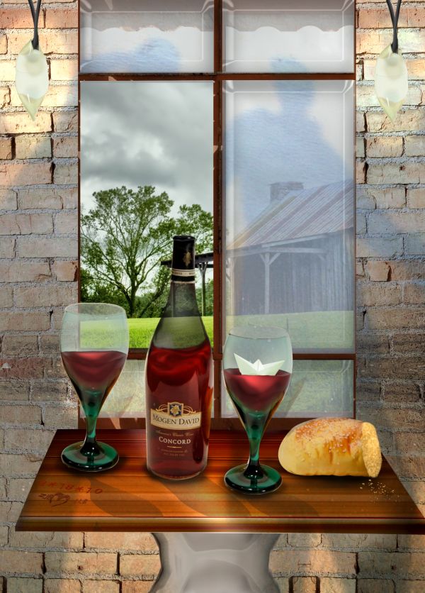
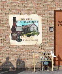
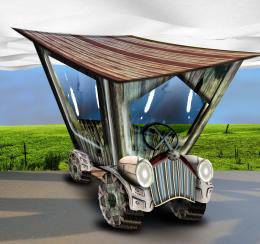
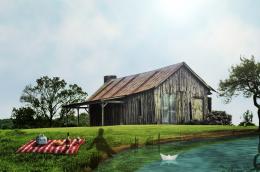
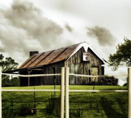
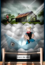
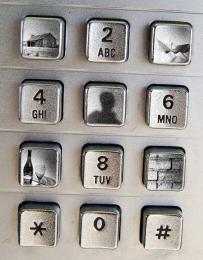
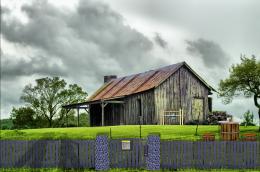
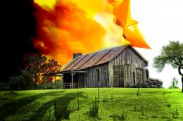
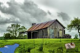
Used all 6 sources. It was tough and the hardest was finding a spot for the shadows. I actually thought they looked like they were dancing so I tried to make a dance/wine and dine type theme. Hope it worked :)
(Sbs is a bit jacked up, I had previously done the bottle and wine glass and paper boat, and kept it in the images so I can see where I was at and my perspective with the table. I ended up changing it around a bit because there was a problem with part of the glass missing sorry). (5 years and 3691 days ago)


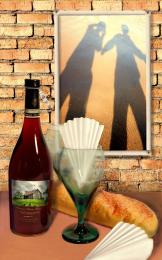
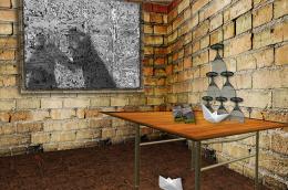


Very nice idea! Just a couple of small things: The wine bottle and glasss should probably be transparent in the area where they're empty; the wine looks a bit unnrealistic (try making it more settled and flat...looks a bit swirled up, unless you want it that way); the shadows of the glasses and bottle would also probably look better if they were a tad darker. Sorry to be so picky but you're done a great job so far and you have a good concept to work with.
Thanks for the tips gameastertip. Made changes and works a lot better.
Yes, looks better now, great! Gl, author.
... WELL DONE !!
!!
Nice effort....
Thanks guys for the comments.
great entry, nice compilation of all the sources. Best of Luck to you.
Howdie stranger!
If you want to rate this picture or participate in this contest, just:
LOGIN HERE or REGISTER FOR FREE