edit this should be better (5 years and 3687 days ago)
Thirsty Work  by Geexman 12211 views - final score: 58.8% | Wine at the table  by MjongE 12034 views - final score: 56.5% | table wine  by huero1418 12200 views - final score: 56.3% |
Suprise 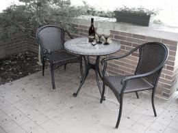 by Jellopudding 10866 views - final score: 56.2% | The Artist 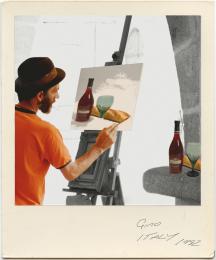 by Geexman 9505 views - final score: 55% | Table 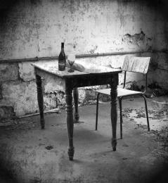 by maryabitawi 13772 views - final score: 54.2% |
Picnic 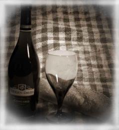 by maryabitawi 4261 views - final score: 52.7% | party 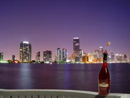 by XphotoshoperX 3134 views - final score: 51.4% | wine 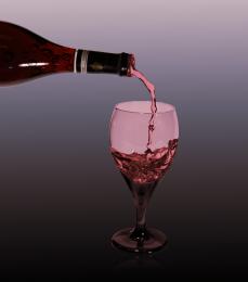 by XphotoshoperX 3793 views - final score: 51.3% |
winefall 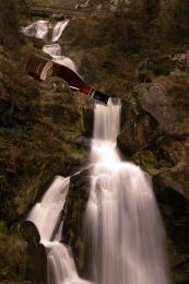 by XphotoshoperX 3067 views - final score: 50.6% |
Howdie Guest!
You need to be logged in to rate this entry and participate in the contests!
LOGIN HERE or REGISTER FOR FREE
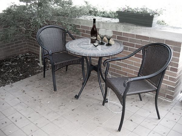
Perspective of the bottle&glasses fit well with the background, but I think that the glasses are transparent. Therefore I expect to see some of the wall instead of how the glasses look like right now. Good luck!
very well done author... and watch out that glasses what wazowski says about... Gl
I already edited it
pretty nice work author......good luck
Very well executed! Just one point: the perspective of the little box on the table is a bit strange for me; too much narrow beside the bottle. I saw the source, I think you don't need to change the original perspective...But only trying to see.
Wonderful idea, you did a great job with correcting the transparency of the glasses. Good Luck!
Howdie stranger!
If you want to rate this picture or participate in this contest, just:
LOGIN HERE or REGISTER FOR FREE