
(5 years and 3680 days ago)
1 Source:
Thirsty Work 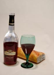 by Geexman 12200 views - final score: 58.8% | Wine at the table 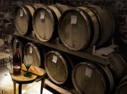 by MjongE 12024 views - final score: 56.5% | table wine 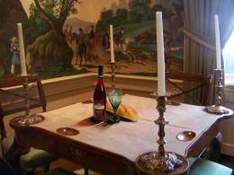 by huero1418 12192 views - final score: 56.3% |
Suprise 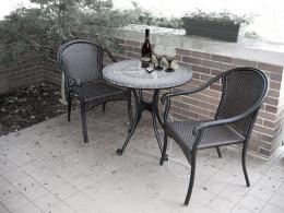 by Jellopudding 10854 views - final score: 56.2% | The Artist 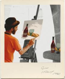 by Geexman 9496 views - final score: 55% | Table 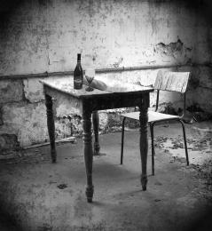 by maryabitawi 13741 views - final score: 54.2% |
Picnic 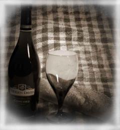 by maryabitawi 4255 views - final score: 52.7% | party 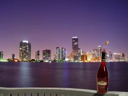 by XphotoshoperX 3124 views - final score: 51.4% | wine 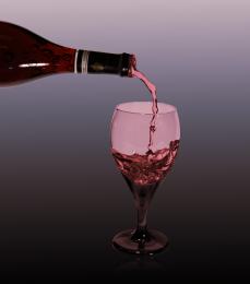 by XphotoshoperX 3785 views - final score: 51.3% |
winefall 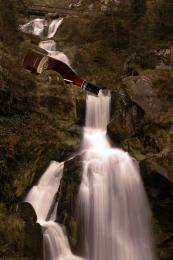 by XphotoshoperX 3063 views - final score: 50.6% |
Howdie Guest!
You need to be logged in to rate this entry and participate in the contests!
LOGIN HERE or REGISTER FOR FREE
Maybe some ideas on how to improve this: 1. try to remove the water which is above the bottle, that way it looks like the water is flushing out of it. 2. try to match the color (light) of the bottle with the background. 3. when done take a little bit extra of off the topside of the bottle (there's a white line) 4. when everything is done make a new layer, use a small soft brush (max 5 pxls) and blur the edges of the bottle (make sure you check "Sample All Layers" before you start). That way the hard edges will disappear. Good luck
Interesting idea, the suggestions that rodvdn made could have made a wonderful creation. GL
agrees...
Howdie stranger!
If you want to rate this picture or participate in this contest, just:
LOGIN HERE or REGISTER FOR FREE