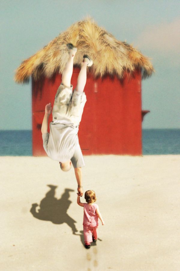
Even though daddy is big, baby Huey has the strength to raise him above his head.
Thanks to SCervino and Grunow at SXC for use of their wonderful stock! (5 years and 3681 days ago)
Now landing could be ...  by Alan2641 17066 views - final score: 60.1% | Climbing.....err up?  by Geexman 9650 views - final score: 58.5% | Magic Mirror  by phillp 12832 views - final score: 58.2% |
new laptop  by basem11361 8752 views - final score: 57.7% | At the Beach 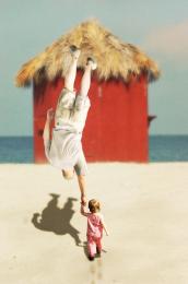 by bjaockx 8761 views - final score: 56.4% | Beer Glass  by Thiago 6874 views - final score: 56.3% |
face up-side down  by basem11361 7286 views - final score: 55.2% | Rear View  by gothgothpunk 5344 views - final score: 55.1% | Sleep Like A King 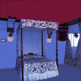 by Chuck 5950 views - final score: 54.9% |
Wha'cha'doin' down there? 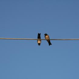 by Giulia 7006 views - final score: 54.7% | Weird face 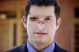 by Lamantine 10410 views - final score: 53.6% | glasses 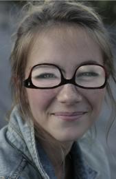 by kevinice95 4834 views - final score: 52.4% |
paladin service w/jello shots  by Drivenslush 8446 views - final score: 51.8% | uhhh reading?  by kevinice95 4558 views - final score: 51.5% | $$$  by basem11361 2893 views - final score: 50.6% |
Statue of Liberty  by nasirkhan 6228 views - final score: 50.2% | Motorbike  by vinji 4224 views - final score: 49.2% | Head  by Lamantine 3344 views - final score: 47.8% |
Yin & Yang  by JustinCase 5721 views - final score: 45.7% |
Howdie Guest!
You need to be logged in to rate this entry and participate in the contests!
LOGIN HERE or REGISTER FOR FREE
That is really cool, however, I wish the baby were in the same focus as the rest of the picture. Everything has a nice Gaussian blur to it and that baby is just crystal clear. Evening out the tones and sharpness of the three main items would really add to the painterly quality of it. Nice job overall though for sure!
thanks elinoree! for the bg part i was attempting to create a bit of depth by having distant objects less in focus... and the baby is in focus becase it is the main object, as is the dad, jsut the dad is swaying slightly in the air which is why he is less in focus... guess if i have to explain it i didn't do a good enough job showing it ;] Thanks for your thoughtful input!
lol... funny
The idea is good, I really like it, but execution needs some improvements. Looks like you're hiding some mistakes on the layer of the father by blurring. You can say it because of the DOF, it's alright, but I can't imagine the father is not in the same plane with the child (because the his shadow is as sharp as the shadow of his kid). Moreover, the right hand of the father needs to be recovered, looks like he loses fingers. Just my opinion, don't take it offensive. Good luck, author
no i was not covering up any mistakes... all blur added was simply for effect... i think i can stand to blur the father's shadow a bit more... thanks for your comments!!! ;]
i like this...
Nice one...gl
what a great idea funny
funny
I think a better source image would have eliminated a lot of your problems to begin with.
she's on steriods!!!!!!!
Howdie stranger!
If you want to rate this picture or participate in this contest, just:
LOGIN HERE or REGISTER FOR FREE