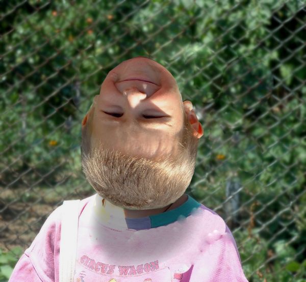
(5 years and 3686 days ago)
1 Source:
- 1: Kid
Now landing could be ...  by Alan2641 17073 views - final score: 60.1% | Climbing.....err up?  by Geexman 9658 views - final score: 58.5% | Magic Mirror  by phillp 12846 views - final score: 58.2% |
new laptop  by basem11361 8763 views - final score: 57.7% | At the Beach 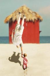 by bjaockx 8766 views - final score: 56.4% | Beer Glass 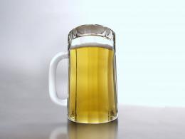 by Thiago 6880 views - final score: 56.3% |
face up-side down  by basem11361 7294 views - final score: 55.2% | Rear View 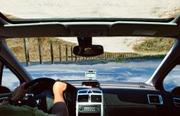 by gothgothpunk 5353 views - final score: 55.1% | Sleep Like A King 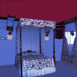 by Chuck 5959 views - final score: 54.9% |
Wha'cha'doin' down there?  by Giulia 7016 views - final score: 54.7% | Weird face  by Lamantine 10417 views - final score: 53.6% | glasses  by kevinice95 4841 views - final score: 52.4% |
paladin service w/jello shots  by Drivenslush 8458 views - final score: 51.8% | uhhh reading? 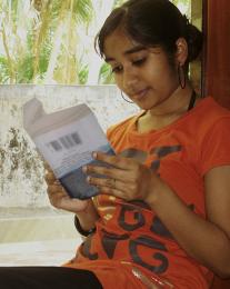 by kevinice95 4567 views - final score: 51.5% | $$$ 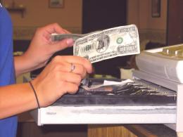 by basem11361 2897 views - final score: 50.6% |
Statue of Liberty  by nasirkhan 6239 views - final score: 50.2% | Motorbike  by vinji 4232 views - final score: 49.2% | Head 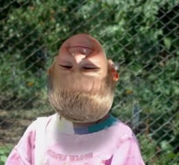 by Lamantine 3350 views - final score: 47.8% |
Yin & Yang 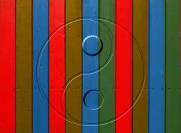 by JustinCase 5730 views - final score: 45.7% |
Howdie Guest!
You need to be logged in to rate this entry and participate in the contests!
LOGIN HERE or REGISTER FOR FREE
Just tuning the head is not quite enough-- now the shadows don;t match the lighting
flip the head horizontally and like alan said, work on matching the shadows
some bad cloning work around the head too.......
i changed a bit ... looks better now ?
Would be nice if the head blended into the neck. Idea is good but perhaps you need a different source. A bald head would be good and would blend nicely. Good luck
Shadows are still wrong. I would suggest a subject where the shadows are not there and you can add them yourself.
Howdie stranger!
If you want to rate this picture or participate in this contest, just:
LOGIN HERE or REGISTER FOR FREE