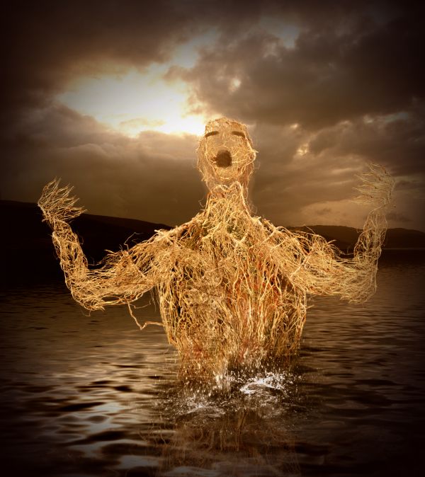
Thanks to mqtrf for sky image
Inspire by Giallo entry (5 years and 3675 days ago)
3 Sources:
Last Hope  by IDt8r 13108 views - final score: 64.9% | Wet soul and light body  by mqtrf 18934 views - final score: 64.9% | Alone  by George55 10004 views - final score: 62.8% |
Spring Nursery  by artgirl1935 9298 views - final score: 62.4% | Cliff Dweller  by pingenvy 11150 views - final score: 62% | Smoking devils  by siderismaris 7106 views - final score: 61.2% |
Nymph  by langstrum 4766 views - final score: 58.9% | Rise 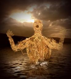 by nasirkhan 4005 views - final score: 57.3% | Wind-Chimes 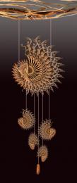 by George55 3262 views - final score: 57.1% |
Swamp Hibernation 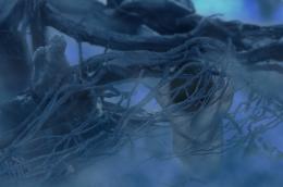 by ricky777 7300 views - final score: 56.3% | Bad Hair Day 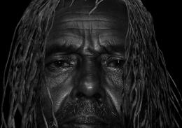 by JustinCase 5928 views - final score: 54.8% | Bean Stalk 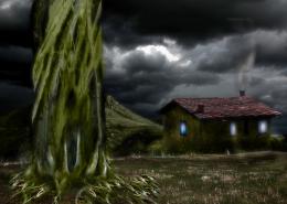 by JustinCase 4952 views - final score: 54.7% |
Creature 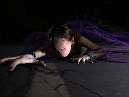 by erikuri 3744 views - final score: 54% | Trichophobia and Ablutophobia 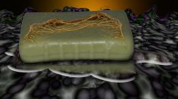 by Drivenslush 8580 views - final score: 53.4% |
Howdie Guest!
You need to be logged in to rate this entry and participate in the contests!
LOGIN HERE or REGISTER FOR FREE
@puppetized: author mentioned that in the description (I don't know that this is the original description or the changed one). Honestly, by comparison, the Giallo's entry is much better (because you said that you were inspired by Giallo's entry, I consider it as your reference, please don't take me wrong, I don't know Giallo, I just want to see how you came with from this reference). Author, with your skill you can bring more effort into this work, it's good but more editing might be much more impressive (some parts on the body can be more defined, especially the face, this kind of improvements is within your reach). Good luck to you
Very neat... would have to put this under HOMAGE.. hehehehe.. Great way to use a great entry in a totally different way (one hand is hard to see.. unless in high res..... good luck author)
I don't know why, but it reminds me a poster of "Ruins"...
puppetized , my first incomplete attempt was this

http://img215.imageshack.us/img215/264/38498426.jpg
but then stop working on this project because its not looks good to me. I searched for another pose and decided to used pose reference, used by giallo entry http://www.pxleyes.com/photoshop-picture/4abc9cf1b25ea/trapped.html. Langstrum no doubt Giallo is great artist, but this image already take too much my time and my layers are now going out of control, until and unless I merge them
nice idea great work !
I agree that you have done lot of work here... since giallo made such a fantastic entry.. This one need to be more effective.. Here the human's body details are totaly missing.. ( even it can be considered as weins or root branches U shuld have used the burn dodge tools under the neck and chest areas.. to get some body feeling.. Only my opinion.. welldone work though.. and Good luck...!!!!
I understand your situation and I also don't want to keep the psd file with merged layer. In my case, I made the second psd file and merge all layers, taking risk and added something more. Maybe we need to take control of layers more efficiently, sometime it brought headache to me also
great job...good luck author
Howdie stranger!
If you want to rate this picture or participate in this contest, just:
LOGIN HERE or REGISTER FOR FREE