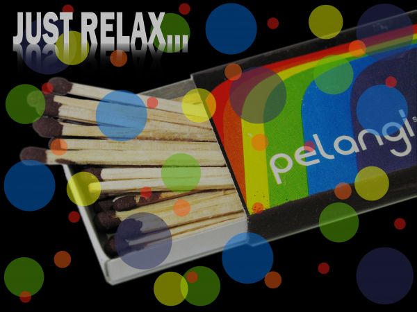
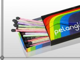
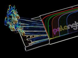
Well, this is more like an advertisenment of the "x" brand of this matches and I would like to hear from your opinion about the image I just did.
Thanks to everybody for your votes.
Well, the technique I applied on the image is that I painted the background black, loaded the image, and free-transformed it to get the size visible on the image.
Then, I just made a series of brushes some of a 500 px and some of a 100 px and the color I just selected from the box of the matches.
then to all the brushes I just lowered down the opacity to a 50% and to the matches I pluged in a 75% opacity and thats it.
For the lettering, I used a font called franklin gothic demi bold or something like that and made a copy to make the reflection just as is seeing below.
Well, I think that those are all the steps that I applied on the image to get the the advertisenment. (5 years and 3678 days ago)








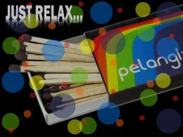


It's MY oppinion: I think the color spots would be better under the subject (if it's an ad, the main subject must be in evidence); and sorry, I didn't get what you meant with "just relax"... If you can explain...
Well, what I just tried to express with "just relax" was that when you smoke a cigarrette, you usually enjoy that moment so, this is the kind of message to people who enjoy smoking you know. So if you like to smoke, you will find out what the main message is talking about.
P.S. I hope I was clear.
It seems a little simple but that's just IMO (in my opinion)
Howdie stranger!
If you want to rate this picture or participate in this contest, just:
LOGIN HERE or REGISTER FOR FREE