
pattern overlay,
gradient overlay,
few brushes,
(5 years and 3669 days ago)
Drunk In the Street 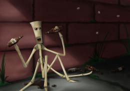 by Kid 13039 views - final score: 64.5% | Match Bulb  by Shamath 13638 views - final score: 58.9% | Pelangi Centipede 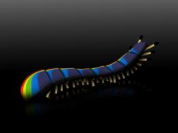 by Sanctuary 11761 views - final score: 58.7% |
burning desire 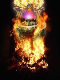 by sawan911 10044 views - final score: 56% | matches fire woman  by siddudezins 9512 views - final score: 55.9% | Pheonix or Dove?  by atajan 13992 views - final score: 53.6% |
Stick dude  by arnold 5035 views - final score: 53.5% | where are the sticks? 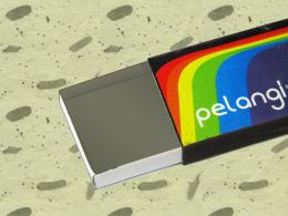 by yagneshahir 6029 views - final score: 51.5% | Twirl invasion  by itsdesign 4204 views - final score: 51.1% |
Fire  by vinji 4235 views - final score: 50.8% | Cup of Matchsticks. 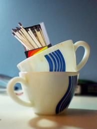 by yagneshahir 4985 views - final score: 50.2% | MaTchBoX 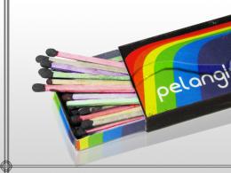 by amarjeetshahkot 3616 views - final score: 48.1% |
Matches advertisenment  by scorpia 6608 views - final score: 47.9% | optical illusion  by hazem 5380 views - final score: 47.2% | Electrifying matchsticks! 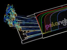 by yagneshahir 8800 views - final score: 45.5% |
Howdie Guest!
You need to be logged in to rate this entry and participate in the contests!
LOGIN HERE or REGISTER FOR FREE
nice idea -- the inside of the box needs some texture and or noise to look like real paper or card board
Yep, I agree with Alan; the way it is now it seems a drawing, doesn't "match" the box!
agrees
Howdie stranger!
If you want to rate this picture or participate in this contest, just:
LOGIN HERE or REGISTER FOR FREE