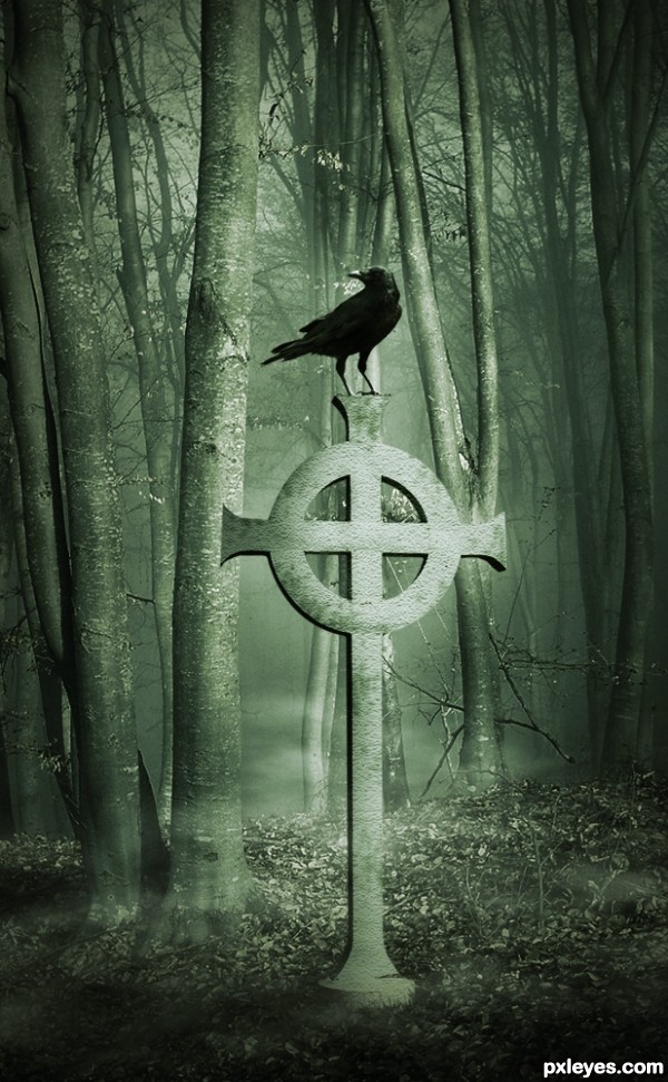
Thanks to UmbraDeNoapte (5 years and 3668 days ago)
2 Sources:
- 1: background
- 2: Crow
Watcher  by ponti55 14650 views - final score: 62.2% | Cave of the Forgotten Souls  by ponti55 13950 views - final score: 59.2% | celtics rock  by gornats 14350 views - final score: 59% |
CBR  by nasirkhan 12042 views - final score: 57.4% | Another Place in Time 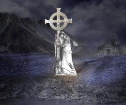 by westfall 13658 views - final score: 55.6% | n/a  by madelinerayne 4470 views - final score: 55.6% |
preeeetty.... 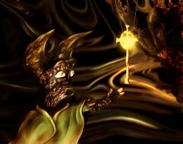 by gornats 3278 views - final score: 55.5% | Celtic Ascent to heaven 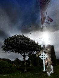 by xwd 7405 views - final score: 55% | Peace Dude! 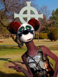 by Drivenslush 5537 views - final score: 53.1% |
relaaaaaax  by MrHack 3151 views - final score: 52.5% | Summer Time Bug  by xwd 5586 views - final score: 51.6% | Gone but Not Forgoten  by Chuck 7176 views - final score: 51.4% |
THE BLOB  by jpsmsu40 10081 views - final score: 51.4% | Spring Time  by Chuck 4391 views - final score: 50.4% | Nature 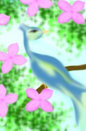 by solaf 6355 views - final score: 47.6% |
Water Cross 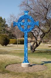 by Alan2641 5931 views - final score: 47.2% |
Howdie Guest!
You need to be logged in to rate this entry and participate in the contests!
LOGIN HERE or REGISTER FOR FREE
Interesting image...flip the crow to match the light source.
I like what you are doing here but you might want to match the color of the cross with the background (select layer with cross > image > adjustments . match color (in CS4)), it somehow stands out a bit to me ATM.
Thank you both, i flipped the crow and followed Rob's advice. Thanks
Beautiful idea! I love the omnimosity here. Just a suggestion to make it really dramatic would be maybe to add some kind of age markings to the cross, either moss or grunge etc. Up to you, of course. It looks great as it is.
Lovely image -- great work on the lighting
very nicely done.. good luck
Very nice idea and mood. GL!
Looks better now author
fantastic........
verey nice
Thank you all for your comments, i've made some changes to the entry, contrast increased and some age stains added to the cross.
Nice image, we can see the side of the cross on the left except for the extreme left of the horizontal piece. Good luck
Barnacle it's due to the perspective the original source was shot
Again, nice image and good luck
the raven floats a little , he is in the mist too - just a suggestion nice mood
Great mood capture. Very eeerie. Nice work.
nice mood author...love it
great ! but you stole my idea !
very nice in its simplicity, good color and mood to this.
loving this
Nice mood.
Nice work and great mood.
congrats Matteo!
congrats
Congrats, it's just a bit creepy
congrats
Congrats!
congratulations dang nice chop buddy
Congrats!!
many congrats! nice work.
Howdie stranger!
If you want to rate this picture or participate in this contest, just:
LOGIN HERE or REGISTER FOR FREE