(5 years and 3747 days ago)
1 Source:
She loves me, she loves me not 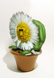 by oana 13655 views - final score: 63.7% | Known as Daisy 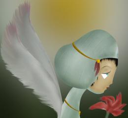 by darkshellie23 13044 views - final score: 59.2% | Daisy Parrot 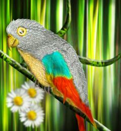 by shaiju1974 9675 views - final score: 58.8% |
one little indian 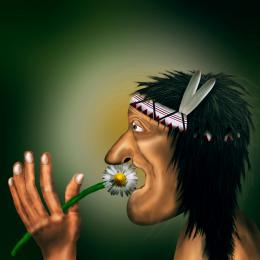 by MrHack 10162 views - final score: 58.5% | daisy Gramaphone 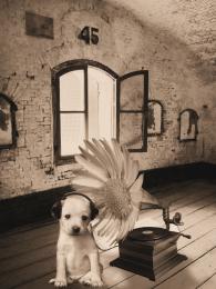 by demi 8598 views - final score: 56.2% | Daisy & Friends  by juanchi 5430 views - final score: 56.1% |
Shuttlecocks 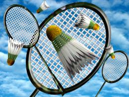 by Drivenslush 4181 views - final score: 55.3% | Pressed Memories  by artgirl1935 3830 views - final score: 54.1% | Daisy Fireworks  by artgirl1935 5937 views - final score: 53.5% |
Daisy Vase  by Fahima 6032 views - final score: 53.3% | Flamingo 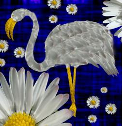 by Lamantine 6008 views - final score: 52.7% | Daisy daisy 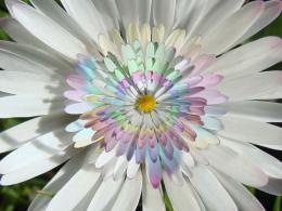 by Gyllenblue 3594 views - final score: 52.6% |
my flower 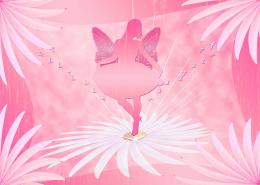 by hazem 3490 views - final score: 52.4% | Earth Faerie 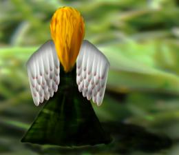 by samvio 7168 views - final score: 52.1% | High Five for Baby Daisy 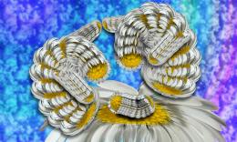 by Drivenslush 2487 views - final score: 51.5% |
Antidote  by UPGRADE 3365 views - final score: 50.1% | The Chaos of Love  by Drivenslush 5434 views - final score: 49.9% | Daisy Gallery  by blindscientist 4448 views - final score: 49.8% |
Daisy Fish  by jadedink 4485 views - final score: 49.5% | fractal daisy  by anarchick 8200 views - final score: 49.4% | Daisy ...  by solaf 6914 views - final score: 49.3% |
daisy clip  by madelinerayne 4375 views - final score: 48.3% | spring whirlpool  by anarchick 4850 views - final score: 45% |
Howdie Guest!
You need to be logged in to rate this entry and participate in the contests!
LOGIN HERE or REGISTER FOR FREE
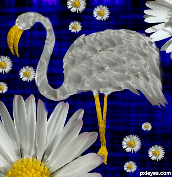
The feathers look a bit out of place, they should all be flowing in the same direction.
I am agree with samvio
the concept is very solid.. might want to add a bit of shading for depth.. but only if you think it needs tweeking.. this would be great in a Hotel Lobby... many places it could fit.. good luck
Feathers look a little better but I agree with Drivenslush about the shading, and maybe make the edges less blurred so that it isn't smudged into the background.
How about trying to smudge slightly the feathers to the same direction?
Nice idea, but imo the idea of using the petals as feathers is completely gone since they're beyond recognition. Go back to your Step 2, have a good look at your reference again and place then the petals in a logic order. May take a little time but is certainly worth it. Good luck!
Edit: looks way better now!
yeah..this entry looks rushed..but I like the concept
thanks Henk, i tried to change the feathers a bit, is it better now ?
nice idea
I think I would have used a different background the blue is a bit distracting from your nice flamingo. Good job though and GL
Howdie stranger!
If you want to rate this picture or participate in this contest, just:
LOGIN HERE or REGISTER FOR FREE