
(5 years and 3659 days ago)
Young Street Artist 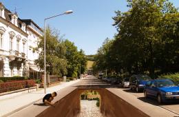 by nasirkhan 41899 views - final score: 64.5% | oldtown falls 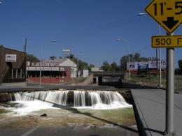 by RAZ0R 35489 views - final score: 58.7% | Grand Canyon State Pot Hole 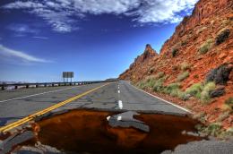 by lchappell 45338 views - final score: 56.4% |
Be aware! Dinosaur! 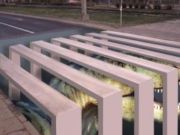 by hymerion 36367 views - final score: 55.7% | Escape 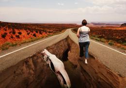 by nasirkhan 32523 views - final score: 54.7% | Hidden Lagoon 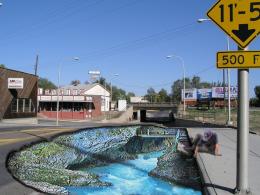 by Geexman 8341 views - final score: 54.5% |
At Least the floor is clean 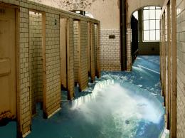 by Alan2641 14145 views - final score: 54.4% | Walking On Sunshine 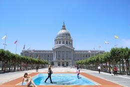 by lchappell 7875 views - final score: 54.3% | Urban Flipper! 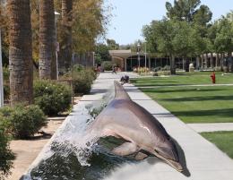 by Geexman 14030 views - final score: 53.2% |
Confrontation Over the Chasm 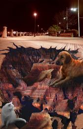 by artgirl1935 7319 views - final score: 53.1% | Not driving on this .... 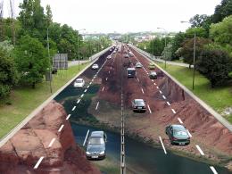 by Alan2641 18314 views - final score: 52.9% | Golfer's Heaven 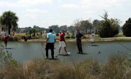 by Drivenslush 6452 views - final score: 52.1% |
Giant Croc Cave 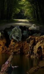 by ricky777 11184 views - final score: 52% | UNDER SICILY 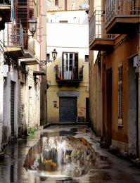 by cterraza 9163 views - final score: 51.9% | Welcoming Pelican 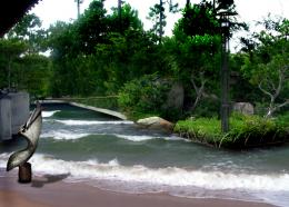 by Drivenslush 7712 views - final score: 50.8% |
No Parking in the Pool 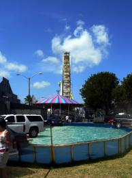 by Drivenslush 7194 views - final score: 49.7% |
Howdie Guest!
You need to be logged in to rate this entry and participate in the contests!
LOGIN HERE or REGISTER FOR FREE
I think your blending still needs a lot of work
Yes, agreed. For starters, sharpen (not with the sharpen tool, but as in make flat) the edge of the drawing--not so feathered, or it looks too unreal. Also, the pelican is crosses out of the logical boundary for the chalk art so it would have to be real, not part of the drawing. If this is the case, then the pelican looks a bit cartoonish. Also, author, don't forget to list your sources.
I don't use sources, accept if a source is offered, the original photos are in the sbs (never did anything like this before so I really don't know what "Blending needs a lot of work" means, I blended til my fingers fell off LOL.. I really thought the drawing should like a drawing.. but I really liked the way the Pelican sculpture is floating on the image... but I could be wrong.. .. but this is my first attempt at something like this.. so it really was a learning experience
Okay, I see, then. Pardon my complain re the sources.
I don't think that was a complaint Games, I think that so many entries have sources that you just assumed this one was the same (and I've NEVER been the same.. though I do have to admit this was a bit weird for me to do.. I'm so used trying to make the two pictures match that having them look like a realistic chalk drawing on a urban environment is very confusing... I even added a paint filter on top of the water and in PS7 it looks fine, but the result after upload looks totally different.. hehehe. but it's good to learn new things (I had to try something
Good effort
blending needs a lot of work means.... here the edges are too much feathered, that it looks unreal... u can have a reference of the same from clicking the link of edgar mueller's works given in the theme.... Gl
well I tried moving the bird around.. didn't look right... I made the edges harder by doubling .. then it looked too much like a photo laid into the picture.. sigh, I'm just going to leave it as is, I can't work on it any more, but thanks for all the help (this will go done as a stumper)
 )
)
EDIT (I succumb to try harder.. see below
What? How does one achieve level 8+ without knowing how to blend the edges better?
Instead of trying to blend the edges better, I would use the pen tool to draw a border around the inside of the natural edge of the drawing to make it appear to be inside of the street rather than on top of it. Look at this image and see if you can see what I mean: http://eviluncle.files.wordpress.com/2009/04/edgar-mueller-1.jpg
@downoffthedragon, ouch!
okay, I STRENGTHENED the edge
Author i like your work very much,but to be better demands a bit more work.Its better to cover the edges with water and other things,with that u will get better blending and whole image will get more realistic look.And would be better if u create couple blending layers.For example with this colors it would be cool to add one dark blue overlay layer,then one dark brown color layer and dark green soft light layer,and maybe,just maybe one golden color layer.With that u will get better blending effect and image will be more realistic...Good luck
thanks erathion, I abandoned the waterfall and changed it into the ocean.. figured everyone wanted the image to go to the edge.. (I didn't use a paint filter (it was hard to resist)... I wish I could source images, but I've done so well without them I don't want the temptation hehehe..

THE ORIGINAL ENTRY IS IN THE SBS (That's what all the comments are about before the ocean change)
This has been a wonderful as well as confusing learning experience... making something look real and fake at the same time was very weird to me..
I also have to admit I gave up on this entry but after all the help and all the new things I learned I'm very happy I tried again.. thanks so much for all the constructive criticisms.. (I even got help from other choppers in PM and that's a really nice way to learn
Now looks fantastic...pelican shadow is great...good luck author
thanks erathion.. and everyone.. you were all a big help
Good Luck with this entry
Author, when I say you always surprise me, I'm not kidding! Incredible... Nice, I wouldn't do better!
Howdie stranger!
If you want to rate this picture or participate in this contest, just:
LOGIN HERE or REGISTER FOR FREE