(5 years and 3665 days ago)
5 Sources:
Pylons of Persephion  by DanLundberg 8447 views - final score: 56.8% | abandoned construction  by sawan911 6619 views - final score: 56.3% | 3D Cubes  by busmav 7563 views - final score: 56.1% |
Castle  by vinji 5139 views - final score: 55.3% | dirty tank 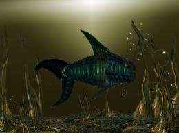 by rakib888 7036 views - final score: 55.1% | Rock Lion 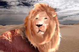 by samvio 6161 views - final score: 53.4% |
dock road 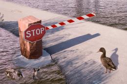 by XphotoshoperX 3850 views - final score: 53.4% | At Sea  by Lamantine 2979 views - final score: 53.3% | Let The Duel Begin!!!  by itsdesign 5831 views - final score: 53.2% |
looking out the window  by lvstealth 4730 views - final score: 52.9% | chocolate heart  by rakib888 4987 views - final score: 52.5% | Retro fantasy  by itsdesign 4147 views - final score: 52.5% |
Howdie Guest!
You need to be logged in to rate this entry and participate in the contests!
LOGIN HERE or REGISTER FOR FREE
nice chop
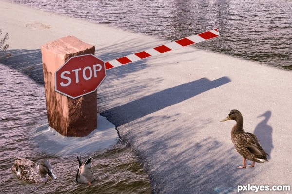
Lol excellent idea! However, the duck's shadow looks really unnaturally warped, and the same goes for the stop sign. Also, the brick's shadow is too long--it should be only about half the size of the bar. Great job on the pond, I must say.
I agree with Game. And with this sun, I think ducks need a lighting from the left side... The ducks in the pond need a shadow too, and stop bar seems a bit flat.
nice !
Howdie stranger!
If you want to rate this picture or participate in this contest, just:
LOGIN HERE or REGISTER FOR FREE