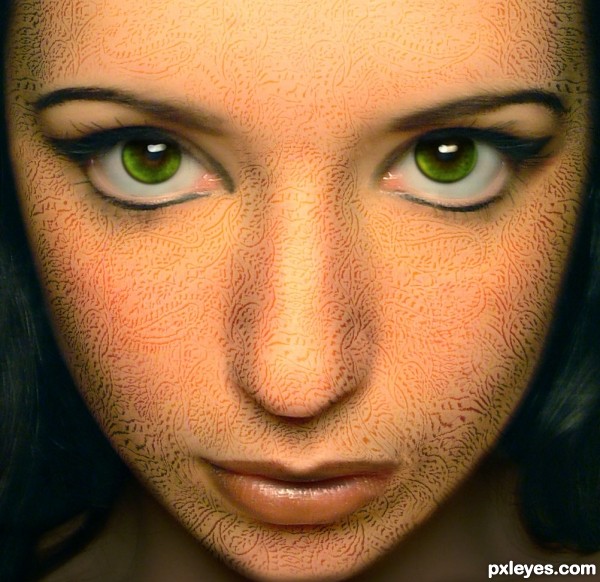
Fun with displacement maps...
EDIT: Changed her eye color to make it even more striking
Thanks to ~liquid-venus-stock of DA for the source photo. She has been linked, (5 years and 3665 days ago)
1 Source:
- 1: Girl
Green Eyes  by chakra1985 31803 views - final score: 62.4% | Rite of Spring  by artgirl1935 26722 views - final score: 61.9% | funny stripe  by MrHack 32677 views - final score: 57.2% |
Key  by priyakamble 27427 views - final score: 56% | its getting hot  by MrHack 29472 views - final score: 55.9% | Exotica  by Irse 5272 views - final score: 54.8% |
Glowing fish  by AdhirAnimator 6876 views - final score: 54.4% | Green Fantasy  by Lamantine 7073 views - final score: 52.6% | Fender Flowercaster  by SuperRoss 4680 views - final score: 52.4% |
Sorry Im late  by Oriel 6600 views - final score: 52.4% | Green pattern Model  by shaiju1974 7269 views - final score: 52.2% | Fantasy Love Birds  by Giulia 7368 views - final score: 52.2% |
Patterned Egg  by dinomario10 9489 views - final score: 51.5% | tattoo  by basem11361 4660 views - final score: 51.4% | the best  by nearmys 4677 views - final score: 50.5% |
Am I Suspended in Gaffa?  by Drivenslush 4943 views - final score: 50.2% | Logstack  by Oriel 3484 views - final score: 48.6% | vintage [updated]  by anarchick 6134 views - final score: 48.4% |
Howdie Guest!
You need to be logged in to rate this entry and participate in the contests!
LOGIN HERE or REGISTER FOR FREE
What about the neck & the area above the eyes?
I noted the neck and the area above the eyes myself and decided I liked it better as a mask of sorts, so didn't extend it to there purposely. It was an artistic decision more than anything else, same as the lips...the pattern just didnt look right there. Besides, the model has great eyes and I didn't want to detract from them
.
though you tried leaving to leave the marks from lips.. a small tiny part is covering the edge of left side of the lips.. please check it.. and needs a bit of feathering near the tear duct of right eye..
Corrected the lips and tightened it up a bit around her left eye. Rather than carry the pattern over, I darkened the neck area to draw attention away from it. Thanks for the tips!
Nice idea and a great effort....Good one....
that was a good move author.. good luck you know I cannot get my eyes off this entry.. dunno y but I'm enjoying just watching it.. so adding it to my favs..
yes it is a great idea and nice work Author
Corrected to show 'thanks' in description. Original 'thanks' and Note with link back to work can be found here : http://liquid-venus-stock.deviantart.com/ .
gay
I like what you did to her eyes.. looks beautiful..
great entry! good luck
Interesting! =)
Howdie stranger!
If you want to rate this picture or participate in this contest, just:
LOGIN HERE or REGISTER FOR FREE