Rooted in the truth.
http://www.youtube.com/watch?v=UAEMjb9TPFM&feature=related
http://www.youtube.com/watch?v=X4DYgOre02s&feature=related
(5 years and 3638 days ago)
3 Sources:
DJ Summer Festival  by genuine2009 13742 views - final score: 61.5% | The Blue Sky Festival  by jaescoe21 15654 views - final score: 61.2% | Polka-Palooza!  by DanLundberg 12270 views - final score: 60.4% |
Ren Faire 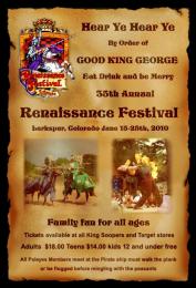 by cabldawg71 10795 views - final score: 57% | The Creatives  by Geexman 9346 views - final score: 56.8% | "Jitterbug's" Jazz Festival 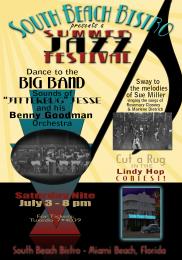 by pearlie 9354 views - final score: 55.6% |
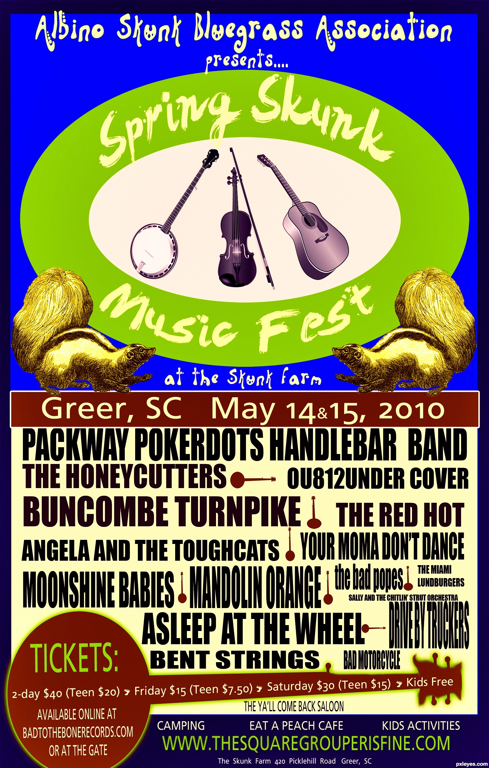
Volunteer Jam 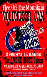 by lchappell 5391 views - final score: 55.5% | Kats Weekender 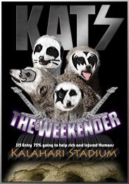 by Geexman 4052 views - final score: 54.9% | Spring Skunk Music Fest 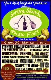 by lchappell 11491 views - final score: 54.6% |
Pxleyes music fest  by itsdesign 7532 views - final score: 54.4% | Jump on the dance floor 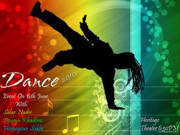 by AdhirAnimator 13495 views - final score: 53.9% | Dance Event 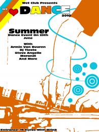 by Galows 13733 views - final score: 53.9% |
Damn Mark Chapman, Damn Cancer  by Drivenslush 7192 views - final score: 53.6% | Ac/Dc 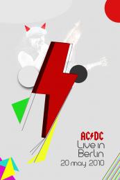 by vinji 3983 views - final score: 52.9% | Silhouette Festival 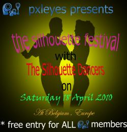 by Lamantine 6383 views - final score: 49.8% |
Howdie Guest!
You need to be logged in to rate this entry and participate in the contests!
LOGIN HERE or REGISTER FOR FREE
Photography and photoshop contests
We are a community of people with
a passion for photography, graphics and art in general.
Every day new photoshop
and photography contests are posted to compete in. We also have one weekly drawing contest
and one weekly 3D contest!
Participation is 100% free!
Just
register and get
started!
Good luck!
© 2015 Pxleyes.com. All rights reserved.


Looks good from down the block, but not quite so much up close. The green ellipse would seem to be the brand focus so I would shrink the "Presents...." (if not the first line as well) to make the ellipse bigger. "Spring Skunk" needs to be as big as "Music Fest." I would position the violin and bow mid-way between the other instruments for better balance and intriguing asymmetry. The skunks are unnoticeable. Reversing the skunks and instruments might be more compelling. [Off-topic quibble: Not sure about the viability of a Friday/Saturday festival compared to a Saturday/Sunday one, or is that just a Friday evening start?.] The band list in the greenish rectangle has too much blank space -- an advertising waste. The online ticket source is not an URL (and "or at the gate" seems wholly unnecessary). I think I would lower the TICKETS banjo so that its bottom falls off the poster.
very nice ,I would like to order some tickets
Asleep at the Wheel ?? I'll be there for sure -- nice one by the way as well
Much improved. [Thanks for the shout out! ] BTW the green URL at the bottom appears to have a misspelling.
Thanks for the spell check there Mr Lundberg that poster is now officially a collector's item.
Demi and Alan2641, cool!... hope to see ya'll there.
Much better good luck
Some of those band names are choice!LOL, the Miami Lumburgers - there used to be several Lums restaurants, we called them 'Slumburgers'. Nice work on the typography!

woot wooot!
Wow! Nice job! Probably too much text, but great !
Nice entry...Love it. GL
seems you've been quite a festival goer. your entry is quite realistic, and very much the sort of thing i would expect to see hanging on the corkboard in my local music shop!
Now, the band listings.... *faint* what an amazing line up! would be one very kick-@ss show!
Howdie stranger!
If you want to rate this picture or participate in this contest, just:
LOGIN HERE or REGISTER FOR FREE