
Share your opinion! =] (5 years and 3656 days ago)
DJ Summer Festival 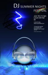 by genuine2009 13771 views - final score: 61.5% | The Blue Sky Festival 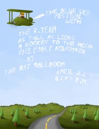 by jaescoe21 15704 views - final score: 61.2% | Polka-Palooza! 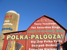 by DanLundberg 12305 views - final score: 60.4% |
Ren Faire 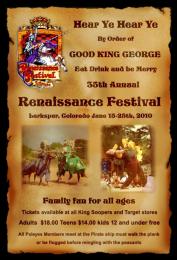 by cabldawg71 10829 views - final score: 57% | The Creatives  by Geexman 9378 views - final score: 56.8% | "Jitterbug's" Jazz Festival  by pearlie 9382 views - final score: 55.6% |
Volunteer Jam  by lchappell 5415 views - final score: 55.5% | Kats Weekender  by Geexman 4071 views - final score: 54.9% | Spring Skunk Music Fest 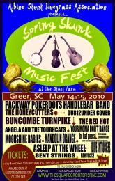 by lchappell 11535 views - final score: 54.6% |
Pxleyes music fest 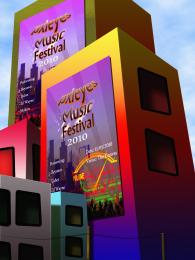 by itsdesign 7566 views - final score: 54.4% | Jump on the dance floor 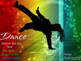 by AdhirAnimator 13542 views - final score: 53.9% | Dance Event 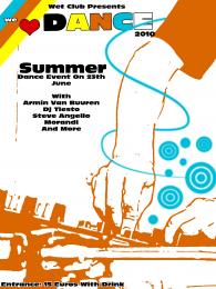 by Galows 13776 views - final score: 53.9% |
Damn Mark Chapman, Damn Cancer 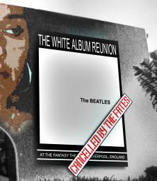 by Drivenslush 7230 views - final score: 53.6% | Ac/Dc 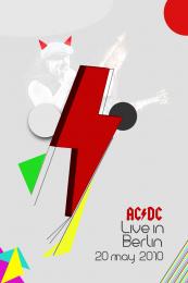 by vinji 3999 views - final score: 52.9% | Silhouette Festival 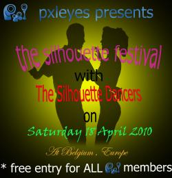 by Lamantine 6408 views - final score: 49.8% |
Howdie Guest!
You need to be logged in to rate this entry and participate in the contests!
LOGIN HERE or REGISTER FOR FREE
Photography and photoshop contests
We are a community of people with
a passion for photography, graphics and art in general.
Every day new photoshop
and photography contests are posted to compete in. We also have one weekly drawing contest
and one weekly 3D contest!
Participation is 100% free!
Just
register and get
started!
Good luck!
© 2015 Pxleyes.com. All rights reserved.


It´s nice, but not so AC/DC at first sight. Maybe that is good...
I like the idea of focusing on the lightning bolt. Right guy should be repositioned so he doesn't have lightning bolt over his face. The guys are like ghosts. Maybe making them black & white and boosting the contrast or maybe applying a filter might yield something graphic that could be made more visible. (One green guy and one yellow guy?) The text font is cool but text placement seems random. "Live in Berlin" is centered but not under "AC/DC" while the date doesn't seem to line up with anything. I would right-justify everything. "Live in" seems unnecessary so I would delete it and expand "AC/DC" until it's exactly as wide as "Berlin."
And the bolt is made in illustrator,,,
it's cool Author
AC/DC!!! yeey!
yeey! 
Very clean looking design. good luck with this
hmm simplistic yet cool
Howdie stranger!
If you want to rate this picture or participate in this contest, just:
LOGIN HERE or REGISTER FOR FREE