Hi All,
Here is submission for this contest.
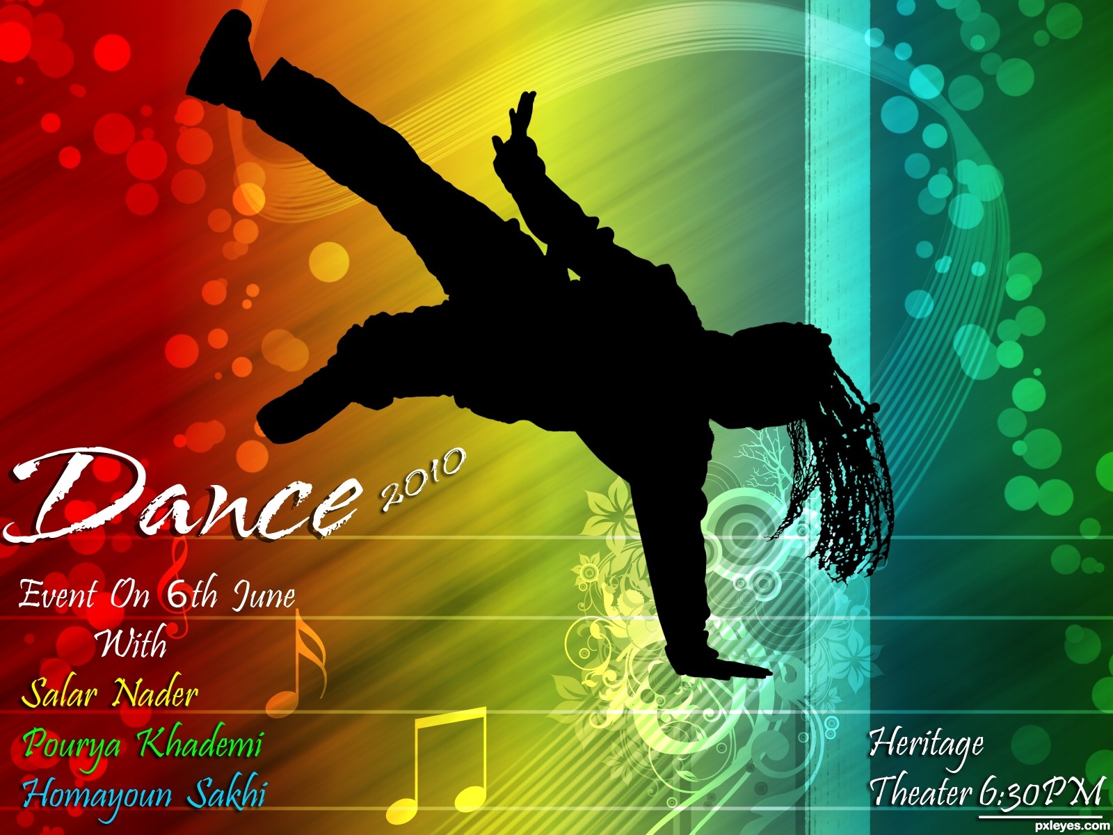
Use Photoshop custom tool and lots of Brush and blur...
Hope you like... I really love this! (5 years and 3661 days ago)
2 Sources:
DJ Summer Festival  by genuine2009 13787 views - final score: 61.5% | The Blue Sky Festival  by jaescoe21 15727 views - final score: 61.2% | Polka-Palooza!  by DanLundberg 12321 views - final score: 60.4% |
Ren Faire 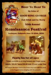 by cabldawg71 10844 views - final score: 57% | The Creatives 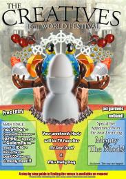 by Geexman 9389 views - final score: 56.8% | "Jitterbug's" Jazz Festival 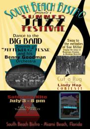 by pearlie 9400 views - final score: 55.6% |
Volunteer Jam 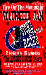 by lchappell 5425 views - final score: 55.5% | Kats Weekender 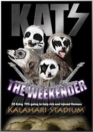 by Geexman 4077 views - final score: 54.9% | Spring Skunk Music Fest 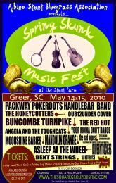 by lchappell 11548 views - final score: 54.6% |
Pxleyes music fest  by itsdesign 7573 views - final score: 54.4% | Jump on the dance floor  by AdhirAnimator 13556 views - final score: 53.9% | Dance Event 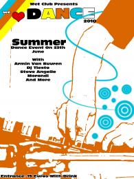 by Galows 13788 views - final score: 53.9% |
Damn Mark Chapman, Damn Cancer  by Drivenslush 7242 views - final score: 53.6% | Ac/Dc  by vinji 4002 views - final score: 52.9% | Silhouette Festival  by Lamantine 6425 views - final score: 49.8% |
Howdie Guest!
You need to be logged in to rate this entry and participate in the contests!
LOGIN HERE or REGISTER FOR FREE
Photography and photoshop contests
We are a community of people with
a passion for photography, graphics and art in general.
Every day new photoshop
and photography contests are posted to compete in. We also have one weekly drawing contest
and one weekly 3D contest!
Participation is 100% free!
Just
register and get
started!
Good luck!
© 2015 Pxleyes.com. All rights reserved.


Thanks kevinice...
Pretty cool. If "2010" is not important, then I would move it down alongside "June" or even delete it. If it is important, then I would make the font size the same as "Dance." (I'd personally name the festival "Dance2010" [one word] and let the final zero go partially behind the silhouette if need be.) "Event On" is kind of unnecessary. Putting all the venue, date, and time info together in the lower right makes more sense to me. (I'd put "Heritage Theater" on one line and use the same font for both 6's.) "With" could be smaller (no initial cap?) as it's not that important a word.
I agree with Dan. Try to do the changes, see how final image gets, then decide if you upload it updated or not...
I tried that... but not looking top notch

If you have any other suggestion, please let me know
Nice!
Very nice work.......love the whole feel of the entry. GL
I love it too! great colors and design
Howdie stranger!
If you want to rate this picture or participate in this contest, just:
LOGIN HERE or REGISTER FOR FREE