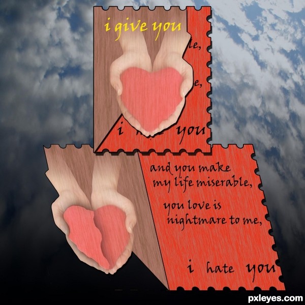
i said she make my life miserable ,it was mistake (5 years and 3646 days ago)
Dear John...  by loopyluv 13960 views - final score: 62.4% | Ex-sentiments  by spaceranger 10468 views - final score: 62.1% | Brothers B-Day Card  by Chalty669 16755 views - final score: 61.3% |
The Ocean  by Drivenslush 9832 views - final score: 57.4% | Best. Insult. Ever.  by IDt8r 12113 views - final score: 57.2% | Chick'n'Chick 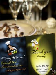 by langstrum 3753 views - final score: 57% |
to my love...  by jadedink 3463 views - final score: 56.7% | Letter from Confucius 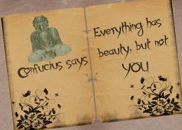 by Lamantine 7227 views - final score: 56.3% | Hairy Caveman 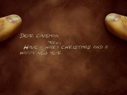 by artist3001 21370 views - final score: 56.3% |
card 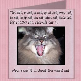 by demi 4050 views - final score: 55.1% | My Card 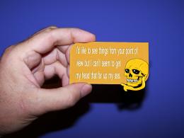 by lchappell 4288 views - final score: 54.4% | Card for Stalkers 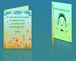 by Giulia 6925 views - final score: 53.9% |
"Thank you" card 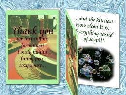 by erikuri 6066 views - final score: 53.7% | For a loser 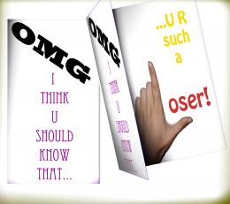 by rasellia 5052 views - final score: 53.3% | A Thought 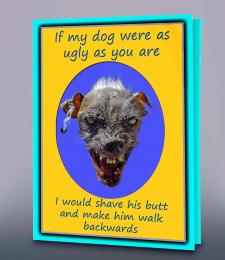 by lchappell 3676 views - final score: 52.7% |
I'm going to Hell for This  by Drivenslush 4693 views - final score: 52.6% | card to my love 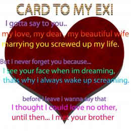 by kevinice95 5019 views - final score: 52.3% | Bottle of Maple Syrup 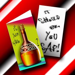 by Drivenslush 6402 views - final score: 52.2% |
Some good wishes  by bachoder 7768 views - final score: 51.4% | i hate you 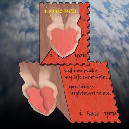 by hazem 5296 views - final score: 51.2% | Sports man 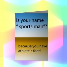 by kevinice95 4343 views - final score: 47.8% |
have a nice day  by SHIPLEYGIRL 5354 views - final score: 31.8% |
Howdie Guest!
You need to be logged in to rate this entry and participate in the contests!
LOGIN HERE or REGISTER FOR FREE
It should be I hate you :/
right!!!
i heat you too...
kewl!
You should lean the "I heat(hate) you" a little bit more so the perspective gets aligned with the card.
Pretty good.
thanks for all and i correct the mistake
The hands and the hearts (whole and broken) are virtually invisible, yet I believe they are an important part of the message. I think they need to stand out much more. I like how the front edge is cut in such a way as to lull the recipient into thinking that the message inside ends with "I love you." (I wish the interior of the open card looked like it were truly a perfect match of the partial interior seen with the closed card.)
EDIT: Cutting out even more of the lower front around the left side of the heart so the underlying "i" and a bit of the following long stroke on the start of "hate" is revealed to really mislead the recipient as to the conclusion of the real message would be even more compellingly evil and on-theme.
thanks for all thye give me advice and specially for (DanLunderg)
GL
great entry.. gl
good luck
Howdie stranger!
If you want to rate this picture or participate in this contest, just:
LOGIN HERE or REGISTER FOR FREE