(5 years and 3722 days ago)
1 Source:
- 1: source1
Dear John... 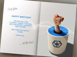 by loopyluv 14152 views - final score: 62.4% | Ex-sentiments  by spaceranger 10591 views - final score: 62.1% | Brothers B-Day Card  by Chalty669 17078 views - final score: 61.3% |
The Ocean 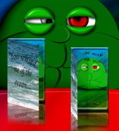 by Drivenslush 9966 views - final score: 57.4% | Best. Insult. Ever. 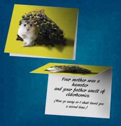 by IDt8r 12349 views - final score: 57.2% | Chick'n'Chick 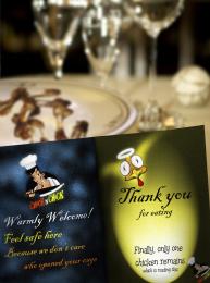 by langstrum 3830 views - final score: 57% |
to my love...  by jadedink 3548 views - final score: 56.7% | Letter from Confucius 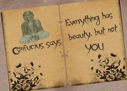 by Lamantine 7417 views - final score: 56.3% | Hairy Caveman 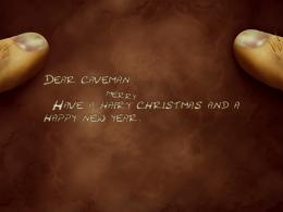 by artist3001 21953 views - final score: 56.3% |
card  by demi 4161 views - final score: 55.1% | My Card  by lchappell 4411 views - final score: 54.4% | Card for Stalkers 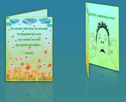 by Giulia 7076 views - final score: 53.9% |
"Thank you" card 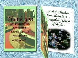 by erikuri 6249 views - final score: 53.7% | For a loser 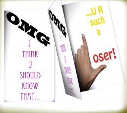 by rasellia 5161 views - final score: 53.3% | A Thought  by lchappell 3762 views - final score: 52.7% |
I'm going to Hell for This  by Drivenslush 4810 views - final score: 52.6% | card to my love  by kevinice95 5153 views - final score: 52.3% | Bottle of Maple Syrup 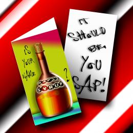 by Drivenslush 6571 views - final score: 52.2% |
Some good wishes  by bachoder 7956 views - final score: 51.4% | i hate you 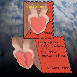 by hazem 5436 views - final score: 51.2% | Sports man 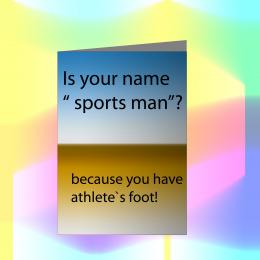 by kevinice95 4517 views - final score: 47.8% |
have a nice day  by SHIPLEYGIRL 5486 views - final score: 31.8% |
Howdie Guest!
You need to be logged in to rate this entry and participate in the contests!
LOGIN HERE or REGISTER FOR FREE
Photography and photoshop contests
We are a community of people with
a passion for photography, graphics and art in general.
Every day new photoshop
and photography contests are posted to compete in. We also have one weekly drawing contest
and one weekly 3D contest!
Participation is 100% free!
Just
register and get
started!
Good luck!
© 2015 Pxleyes.com. All rights reserved.


Cool, looks real ;D
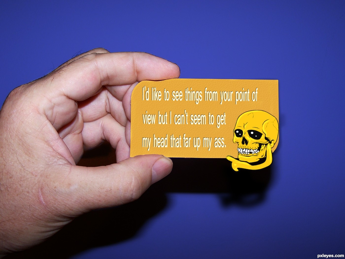
Nice, but I would darken the letters a slight, hard to see. Also with the text; Move "that" down a step. It´s to close to the scull.
Maybe you can have it "not centered". Otherwise good job!
hehehe..
Pretty good
Several points of view make the difference

Great...love this...good luck author
Very innovative to interpret "card" as business card and I always like when the entry goes beyond the basic requirements to provide some context (the hand in this case). I think we can all relate to the sentiment, but apparently its wordiness necessitated squishing the letters which makes it a little bit difficult to read IMO. The skull graphic seems totally arbitrary (why a skull?) and I question going outside the dimensions of a standard business card -- which is maybe being too practical, but I do think an unexpected message in a standard format is the point of this contest. Also, I would expand the title to "Nice to meet you. Here's my card." (if that much length is allowed). {Would "Nice meeting you. My card." fit?} [BTW a comma after "view" wouldn't take up much space.]
Funny and a different "take"on the format. I don't see a particular reason for a skull either but that doesn't bother me at all. BTW DanLundberg, you wouldn't put a comma in front of a conjunction such as but or and. That wouldn't be proper grammar.
Much better after the changing. GL
GL
i like the skull, it sets the mood for the business at hand
what a nice card lol
Cool, business card
Great idea......gl
cool entry, author! GL
nice job
Howdie stranger!
If you want to rate this picture or participate in this contest, just:
LOGIN HERE or REGISTER FOR FREE