http://www.flickr.com/photos/pedrosz/2243862156/sizes/l/ (5 years and 3629 days ago)
1 Source:
- 1: Backgound
Heart  by CorneliaMladenova 8389 views - final score: 64.8% | Pendant  by CorneliaMladenova 8610 views - final score: 64.3% | I thought I am a warrior!!  by rakib888 12725 views - final score: 62.4% |
The Guardian of Hell 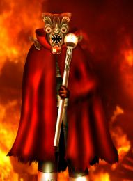 by oana 9630 views - final score: 60.4% | Donquixote 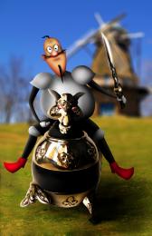 by langstrum 7241 views - final score: 60.2% | Gladiator (updated) 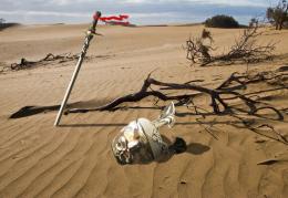 by busmav 6018 views - final score: 60.2% |
Landing... 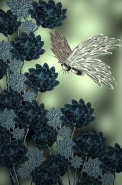 by Mario 3456 views - final score: 59.3% | find an idea  by derdevil 5017 views - final score: 59.2% | War of the Worlds 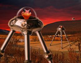 by spaceranger 5654 views - final score: 59.1% |
Face  by lahiripartha 3492 views - final score: 58.6% | Ampolla  by TemporaNigra 5072 views - final score: 56.9% | The Hunter  by Geexman 3615 views - final score: 56% |
Golden Lightship  by 04mehul 5569 views - final score: 55.3% | Fans  by Lamantine 3785 views - final score: 55.1% | ...with Flag 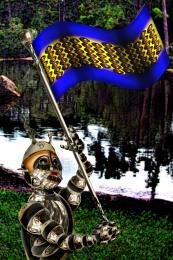 by Drivenslush 4537 views - final score: 54.9% |
...da da da da DA DA SWAN MAN! 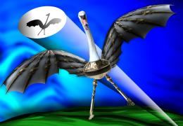 by Drivenslush 5259 views - final score: 53.8% | snake 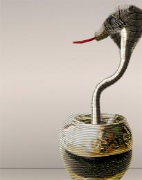 by migue1ito 4642 views - final score: 53.7% | reflecting 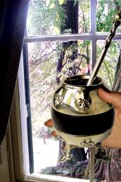 by lvstealth 2874 views - final score: 52.9% |
bubbles  by migue1ito 3179 views - final score: 52.5% | hans and gretel missing... 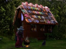 by Se7eN0f9 6475 views - final score: 52.1% | Game On! 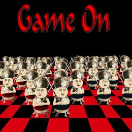 by Chuck 3509 views - final score: 51.3% |
Mountain Man 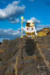 by Chuck 4320 views - final score: 50.2% |
Howdie Guest!
You need to be logged in to rate this entry and participate in the contests!
LOGIN HERE or REGISTER FOR FREE
epic work author
nice
Nice
great work ! higher res would be better IMO , good luck !
very cool!
Nice one...gl
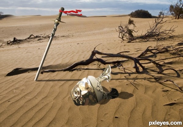
cute! gl. just a nit pick the shadow is not quite right, the seam or rib on the cup is on the ground yet it is part of the shadow and the sun seems to be about overhead on the other shadows (the driftwood right above it has a curved branch that shows it straight as though it is overhead it would show the curve if the sun were at the horizon which is about where it would be for the shadows you have on the fallen soldier.) the shadow of the sword is over the shadow of the wood next to it. the way the hilt shadow is and the hilt arent quite right. it is turned and the shadow is not. great idea! very cute!
Very impressive! We can see the defeat of a gladiator, who fighted till his death and after that was forgotten. At least, it was my point of view... GL, author!
nice...
nice
The shadow of the sword needs to be thinner. The helmet should be slightly in the sand, not just floating on top of it. That said, I like your idea.
Great SBS. Impressive work.
Thanks guys for support and sugestions, I fix the shadows a bit. And I hope it's look better now.
nice idea looks better now. good luck
Howdie stranger!
If you want to rate this picture or participate in this contest, just:
LOGIN HERE or REGISTER FOR FREE