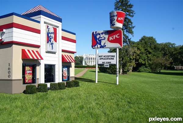
(5 years and 3644 days ago)
2 Sources:
- 1: dbaron
- 2: Roadsidepictures
The Steak Out  by Ressiv 8987 views - final score: 60.2% | A perfect spot  by Ressiv 8786 views - final score: 59.9% | American Classic  by lchappell 8226 views - final score: 58.4% |
The Hover-Inn  by Geexman 6687 views - final score: 57.9% | Middle Of Nowhere 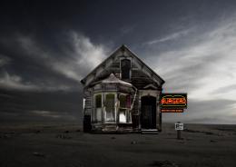 by fatz8016 7667 views - final score: 56.4% | Wendy 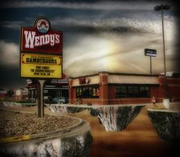 by nasirkhan 3522 views - final score: 56.4% |
Deadman's Cafe 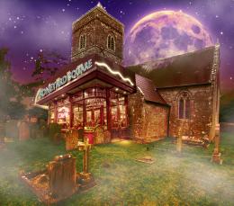 by dollmommy 5646 views - final score: 55.9% | Burger King 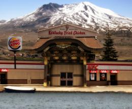 by nasirkhan 5583 views - final score: 55.8% | HUH??? 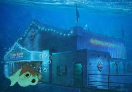 by Geexman 4073 views - final score: 54.7% |
McDonald 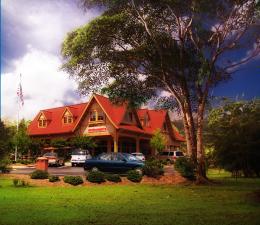 by nasirkhan 3360 views - final score: 54.6% | Sky Walk Restaurant NYC 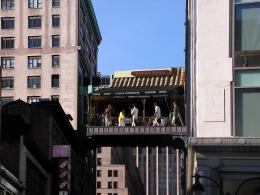 by Drivenslush 7566 views - final score: 53% | Don't Eat Here 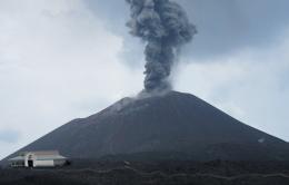 by k5683 5827 views - final score: 50.5% |
Howdie Guest!
You need to be logged in to rate this entry and participate in the contests!
LOGIN HERE or REGISTER FOR FREE
great blending
omg, love it! d'ya think they serve chitlins???
Great work author 110% realistic...well done
Hah, nice
This is friggen Great Author. A lovely idea too


Nice idea, perspective of KFC building is off.


EDIT: Great update. Much better now
Clever idea (although a KFC in the West Wing of the White House itself would be more compelling). nasirkhan is right on about the perspective. The KFC source pic's horizon line (which would be the location of the KFC's vanishing point) appears to run roughly at the level of the bottom 0 in the house number on the far edge of the building -- which is well below the horizon line in the White House pic.
I get it. But I don't think that it's funny.
Oh, I love KFC!!! The secret seasoning of 11 herbs... yum! Unfortunatelly we don't have KFC in Brazil anymore...

Thanks everyone for your comments and suggestions. I tried to adjust the grade of the south lawn I hope the Chicken house's perspective is better. Erikuri, my fried chicken is way better than the Colonels, besides if you eat too much KFC it'll make you fat, lol
Much improved perspectively. And bigger is indeed better! Plus I think the "no jobs" on the sign adds a hint of political commentary. [Not clear if downoffthedragon merely doesn't find the image humorous (not a requirement of the contest) or if he/she disapproves of disrespecting the White House (a legitimate opinion).]
I chose the Kentucky Fried Chicken building because I like their colors, Red, White, and Blue. Therefore my title: "American Classic"
looks very good
@DanLundberg: Yeah, it was about the disrespect, mostly because of another comment posted here. I appologize for getting all political here.
@Author: "American Classic", cool.
http://www.chitlinstrut.com/
@Author: Yuck!!!!
Author, I totally agree with you! No, I don't use to eat so much fried food, I get sick, and I know it's not good for health. I hardly ever eat a tempura (japanese fried food)... But I like the KFC seasoning... If you say your fried chicken is better, send me some for e-mail!!!
i heard Author has been frying chicken longer than the Colonel!

@ RAZOR... hell I am the original recipe!

@ downoffthedragon...don't diss'em if you ain't tried 'em
you bet ya chitlins ar dang good eating and i hope to someday try that chicken. Love it fried woot!! yummy
yummy
from regular view this looks pretty good and was well thought out. With the large preview you can tell the KFC is of a lower resolution. I would've suggested either downsizing the total image to match the KFC source or you could have downsized it and then upsized it so it was also pixelated like the KFC source.
great job! GL
Nice work......GL
great job
Congrats for your third place, Loyd!
Congratulations for 3rd
Congrats!
congrats !!
Congrats!!!!
Congrats!!!!
congrats chappy (little late.. but I'm a bit busy torturing you know who..hehehe)
Congrats!!
congrats, Poppa, nice work!
Howdie stranger!
If you want to rate this picture or participate in this contest, just:
LOGIN HERE or REGISTER FOR FREE