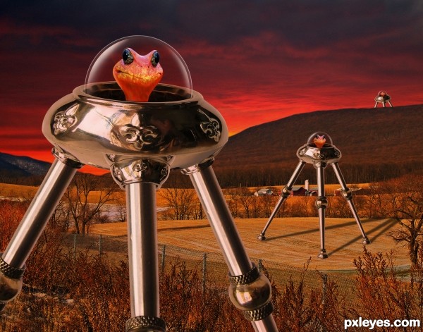
Based on the H.G.Wells classic. These cute little aliens love burning up a planet for fun.
(5 years and 3727 days ago)
3 Sources:
Heart  by CorneliaMladenova 8558 views - final score: 64.8% | Pendant  by CorneliaMladenova 8774 views - final score: 64.3% | I thought I am a warrior!!  by rakib888 13028 views - final score: 62.4% |
The Guardian of Hell  by oana 9859 views - final score: 60.4% | Donquixote  by langstrum 7413 views - final score: 60.2% | Gladiator (updated)  by busmav 6177 views - final score: 60.2% |
Landing...  by Mario 3558 views - final score: 59.3% | find an idea 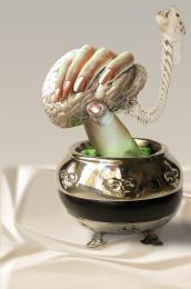 by derdevil 5172 views - final score: 59.2% | War of the Worlds 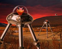 by spaceranger 5816 views - final score: 59.1% |
Face  by lahiripartha 3619 views - final score: 58.6% | Ampolla  by TemporaNigra 5210 views - final score: 56.9% | The Hunter  by Geexman 3749 views - final score: 56% |
Golden Lightship  by 04mehul 5728 views - final score: 55.3% | Fans  by Lamantine 3893 views - final score: 55.1% | ...with Flag  by Drivenslush 4663 views - final score: 54.9% |
...da da da da DA DA SWAN MAN! 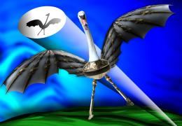 by Drivenslush 5481 views - final score: 53.8% | snake 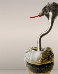 by migue1ito 4755 views - final score: 53.7% | reflecting 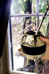 by lvstealth 2937 views - final score: 52.9% |
bubbles  by migue1ito 3263 views - final score: 52.5% | hans and gretel missing... 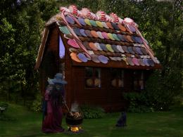 by Se7eN0f9 6674 views - final score: 52.1% | Game On! 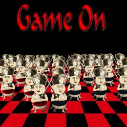 by Chuck 3607 views - final score: 51.3% |
Mountain Man 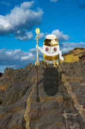 by Chuck 4490 views - final score: 50.2% |
Howdie Guest!
You need to be logged in to rate this entry and participate in the contests!
LOGIN HERE or REGISTER FOR FREE
Great job! Goes to my favs
the 3rd one should be smaller and blurred but it's a good job
the third is smaller...but yes, each one as it goes back should be blurred just a bit more than the one before it
great job btw!
Shadows are wrong author,light source is behind the creatures...Other things are very well made...good luck
Thanks for the suggestions! I made the smallest one a bit smaller thanks hereisasnoop. k5683 thanks, I did have a blur on the 2nd and 3rd but only slightly, I blurred the small one a little more, the second matches the depth of field and if you see the farm buildings behind it they are fairly sharp still. The light source is in front and left of the tripods erathion, notice lighting on the buildings (see original source for clarity, long shadows cast by tree etc.). The red glow in the background is from the burning devastation by the alien machines.
amuzing yet creative, i like it
U are right author,light source is there in the original,but if u like to stay like that adjust a bit sky behind the creatures.Now looks like sun falling behind the hills...U have that orange shine there...
Trust me on this erathion, I've seen my share of burning villages over the hills and they do look like this.
Talking about spaceships, aliens and other stuff like that, it's the same of talking about you! Right?

Very impressive work, and the "cute" aliens really deceive us...
haha.. so funny! GL author, i really like ur job
One of the best in competition
good luck
ice take on war of the worlds . good job.
Howdie stranger!
If you want to rate this picture or participate in this contest, just:
LOGIN HERE or REGISTER FOR FREE