minimalist, complementary colour values (5 years and 3619 days ago)
Just another perspective  by lundmikkel 17681 views - final score: 65% | Floating in the Universe  by CorneliaMladenova 11865 views - final score: 63.8% | Casita  by migue1ito 13591 views - final score: 61.1% |
FUTURE 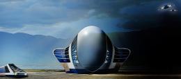 by lolu 9815 views - final score: 60.3% | he loves me 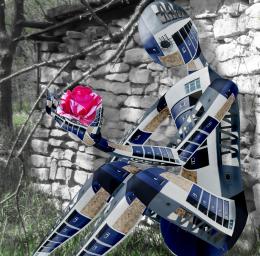 by jadedink 10836 views - final score: 59.9% | Buzzing the Tower 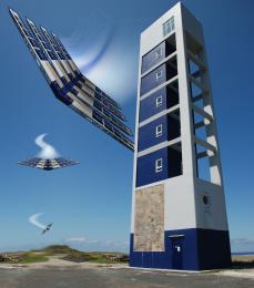 by Drivenslush 6094 views - final score: 57.2% |
Left Behind 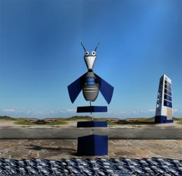 by xwd 4870 views - final score: 56.7% | Robots 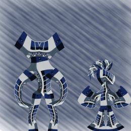 by kevinice95 4730 views - final score: 56.4% | Super robot 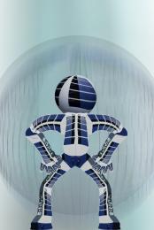 by kevinice95 4238 views - final score: 56.4% |
Orange Coast Control 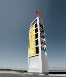 by dandesign05 11248 views - final score: 56.4% | Squishy Buildings  by Drivenslush 5329 views - final score: 56.1% | Space base 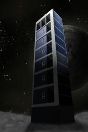 by Noddybear 6884 views - final score: 55.5% |
On A Dark Night  by Chuck 4512 views - final score: 54% | three towers  by migue1ito 3768 views - final score: 52.6% | LeaningTower of Unknown Desert 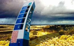 by K2 7960 views - final score: 51.7% |
The Lonely House (Updated) 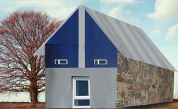 by K2 6247 views - final score: 50.3% |
Howdie Guest!
You need to be logged in to rate this entry and participate in the contests!
LOGIN HERE or REGISTER FOR FREE
Photography and photoshop contests
We are a community of people with
a passion for photography, graphics and art in general.
Every day new photoshop
and photography contests are posted to compete in. We also have one weekly drawing contest
and one weekly 3D contest!
Participation is 100% free!
Just
register and get
started!
Good luck!
© 2015 Pxleyes.com. All rights reserved.


Remove signature. Entries should be anonymous.
I agree with both...
Agreed ! Otherwise, good !
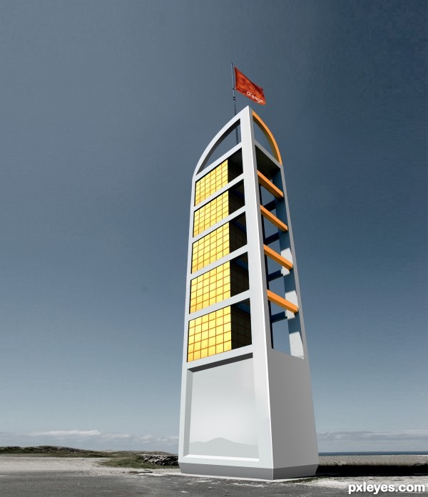
I like the simplicity. The orange seems perhaps a bit bright for being on the shady side of the structure, however. And why not use a minimalist beachscape for the setting?
i promise, next time i'll respect your wishes. thank you
Author, about your signature, you have to remove, not for our wishes; it's a rule of this site that entries must be anonymous! Your entry runs the risk of being taken off for that...
how can i edit it now, as it's already put like this? should i repost it?
do not re-post, goto MyStuff > MyContests then "edit entry" there you can upload a revised version that does not have your logo on it...
Now it's OK!
good job.... expecting an sbs......
@ moderators, it's 90% brush and smudge tool to redesign the lines of the building, and for the windows i colour - balanced and leveled up the cropped module from an existing glass building. Same did for the Orange flag. I'll put them to the sbs.
gud luck dear..........
love this
Nice clean look, but too little difference from the source imho. It was a good start but might have been more creative if you had placed it in a different background or added something created out of the source to enhance your work. GL to you. Just remember, these are just suggestions that I might have done meant to be constructive. Follow what you are comfortable with and follow your own style.
yes, i am able to do lots of things with photoshop... but sometimes i like to stick to the basics and not to exagerate with the transformations... minimal but essential editing could be more valued than a 50 hrs of transformations and resulting a kitsch. thanks alot
Howdie stranger!
If you want to rate this picture or participate in this contest, just:
LOGIN HERE or REGISTER FOR FREE