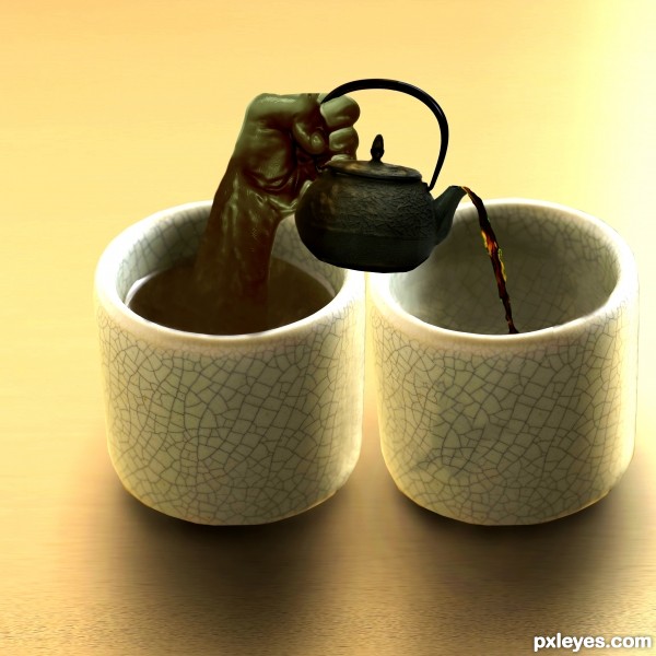
A mildly successful attempt at creating a liquid hand. :) (5 years and 3629 days ago)
- 1: poured tea
- 2: tea pot
- 3: hand

A mildly successful attempt at creating a liquid hand. :) (5 years and 3629 days ago)
Uncle Charlie's  by dandesign05 9542 views - final score: 60.8% | Binocular  by filantrop 6413 views - final score: 58.8% | tea cup  by migue1ito 10846 views - final score: 58.3% |
Abstract Art  by lahiripartha 7144 views - final score: 56.2% | More tea, sir? 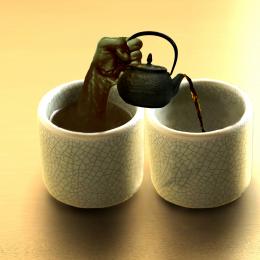 by Noddybear 10385 views - final score: 55.2% | Hot Tea 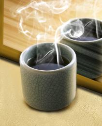 by Drivenslush 6122 views - final score: 54.5% |
Apart 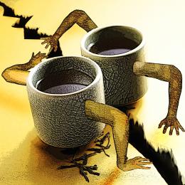 by Javil 11305 views - final score: 54.5% | Black Magicoffee 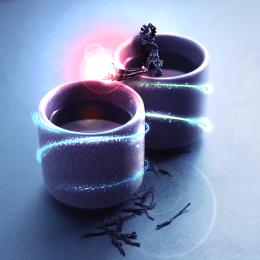 by DeltronZ 4964 views - final score: 54.3% | After Drinks 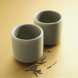 by Tybor 5990 views - final score: 54.1% |
pour me some tea 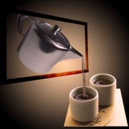 by Se7eN0f9 7666 views - final score: 53.1% | Princess and the Bull Frog  by gejopo 7016 views - final score: 52.4% | wheres the dog? 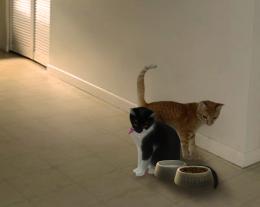 by madelinerayne 5633 views - final score: 50.6% |
The Painting of a Cup  by K2 5751 views - final score: 48.4% | Coffee's Fight  by tnaggar 4987 views - final score: 47.8% | One Girl 2 Cups  by migue1ito 8950 views - final score: 45.7% |
Howdie Guest!
You need to be logged in to rate this entry and participate in the contests!
LOGIN HERE or REGISTER FOR FREE
haha.. great idea author! Best of luck
nice idea -- the liquid coming over the spout looks a bit off but a nice job otherwise
Cool idea, what alan says, good luck
Creative idea. The liquid hand looks fairly good. Some brighter-white highlights (like at the left edge of the tea in the cup) might make it appear more convincing. The teapot doesn't seem tilted enough for tea to be able to escape. The perspective is also off; I would expect to see as much of the top of the teapot as I see of the top of the cups.
@dan: I agree with you, however, for the sake of argument, the teapot could be rotated along the x axis into the z plane, which would allow for the perspective to be correct and the tea would be able to flow from the pot
Looks realistic Nicely done
Agree about the highlights, and since the hand is liquid it should be more translucent, but good idea.
I agree with CMYK about the transparency of tea hand; and for a green tea, the liquid that enter in the other cup is a bit dark, like black tea... But it's really a creative idea!
The z-plane argument is technically correct and indeed explains the apparent lack of arc in the exiting tea (it's flowing away from the viewer). Maybe changing the title to "More sideways tea, sir?" would alert the viewer that a non-traditional interpretation is required. And I just realized that the teapot isn't casting any shadow (which might provide some insight into its orientation)!
A really creative effort. GL
Great idea, you did wonderful work with this. Good Luck to you!!
nice job
Howdie stranger!
If you want to rate this picture or participate in this contest, just:
LOGIN HERE or REGISTER FOR FREE