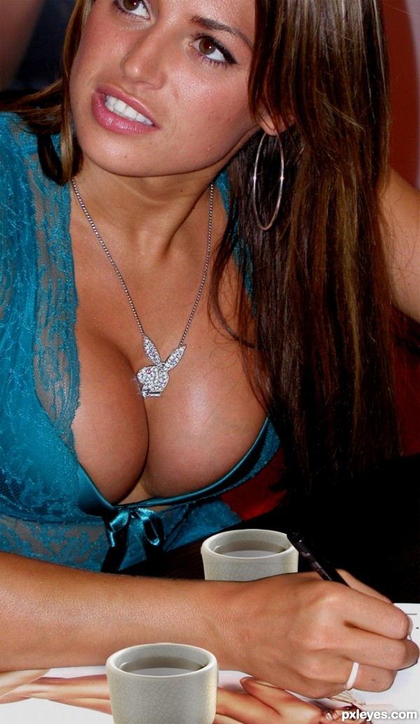
http://www.everystockphoto.com/photo.php?imageId=4312301 (5 years and 3707 days ago)
1 Source:
- 1: source1
Uncle Charlie's 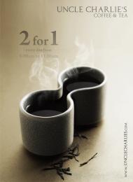 by dandesign05 9710 views - final score: 60.8% | Binocular  by filantrop 6521 views - final score: 58.8% | tea cup  by migue1ito 11055 views - final score: 58.3% |
Abstract Art  by lahiripartha 7261 views - final score: 56.2% | More tea, sir? 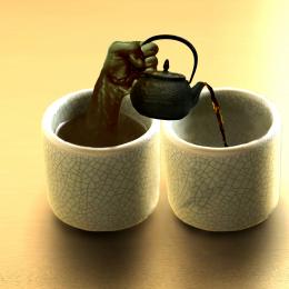 by Noddybear 10564 views - final score: 55.2% | Hot Tea 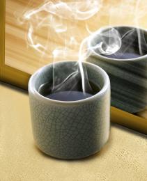 by Drivenslush 6228 views - final score: 54.5% |
Apart 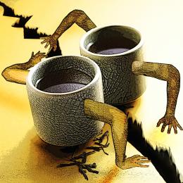 by Javil 11591 views - final score: 54.5% | Black Magicoffee 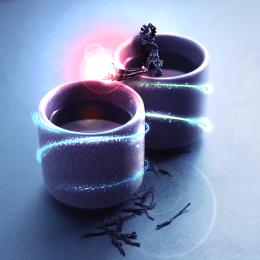 by DeltronZ 5050 views - final score: 54.3% | After Drinks  by Tybor 6112 views - final score: 54.1% |
pour me some tea  by Se7eN0f9 7858 views - final score: 53.1% | Princess and the Bull Frog  by gejopo 7198 views - final score: 52.4% | wheres the dog?  by madelinerayne 5813 views - final score: 50.6% |
The Painting of a Cup  by K2 5914 views - final score: 48.4% | Coffee's Fight  by tnaggar 5095 views - final score: 47.8% | One Girl 2 Cups  by migue1ito 9135 views - final score: 45.7% |
Howdie Guest!
You need to be logged in to rate this entry and participate in the contests!
LOGIN HERE or REGISTER FOR FREE
haha i was thinking along those lines but you beat me too it
i think to make it better you could change the light sources on the cups...
Still looking for the source....... OH there it is! Was a little distracted. I'm just glad she not pooping in them

But seriously, the cups are still showing the same brighter light source than the busty gal you chopped them into. Try adjusting the contrast levels on the cups layer or even dodge and burn. It would look more realistic. But hey, props to keeping me distracted
hey.. where is the source image..? this should be off theme isn't it.. I swear I looked everywhere in the entry for source image.. btw jawshs is right.. take care of that..
I see I was not the only one distracted :P
I want to comment but that means scrolling away from the picture!
they look like collage... the luminosity and the contrasts are totally opposite. and being a free photoshop editing, i won't say the main subject of the creation is the center of attention, but i think it should be. Good luck
Two cups? Which cups? G cups?

Sorry... Japanese tea cups are a bit small (or the boobs are a "bit" big...) and the backward one must be a slightly darker for shadows...
thanks for the comments everyone, very helpful but seriously, who's looking that far down in the picture...i mean, come on now......
yea author.. nice picture.. and well said barracuda and erikuri..

Imagine whole set of cups...then no one could find source image parts...Good luck author,great cups,mistake idea,idea...lol
gud luck
luckily, being a female, and not breast obsessed, i can look past the image used for this one and see two chopped cups plopped down on a picture. There is so much more that could have been done with this idea. i get what you were attempting and all, but really, just because there is a pair of breasts in there, doesn't mean that its a decent chop.
work more on the execution of it. add dimension to those cups, shadowing to give them more "believable" standings in that picture. she is signing autographs, she'd have knocked over those tiny cups with her arm..or the obnoxious fake ta-tas.
don't know about all that but nice pair Author

giggle! look at the varicose veins on the breast! she needs some "touch" up... hehe. and i firmly agree with jadedink, you just plopped the cups in. you guys really like that? hm...
not realy, just thought it'd be funny...
i dont know about vericose.
Howdie stranger!
If you want to rate this picture or participate in this contest, just:
LOGIN HERE or REGISTER FOR FREE