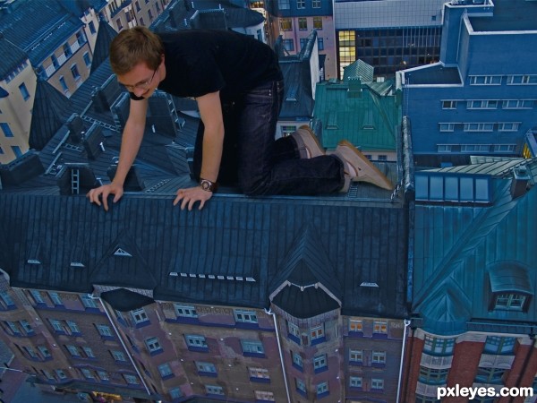
Thanks to Ingorrr at Flickr. (5 years and 3625 days ago)
1 Source:
- 1: Man
The Observer  by IDt8r 10868 views - final score: 66.7% | Are you Ready.....???  by hereisanoop 10199 views - final score: 64.8% | Of Flowers and Jewels  by artgirl1935 13180 views - final score: 61.3% |
The Flood  by Ressiv 8966 views - final score: 61.2% | Locomotive 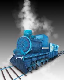 by Mayechung 15362 views - final score: 59.8% | Grow Old with Me 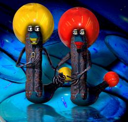 by Drivenslush 5523 views - final score: 59.2% |
Mortal jump 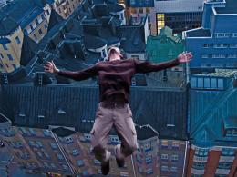 by erikuri 6842 views - final score: 58.7% | Fire in the hole! 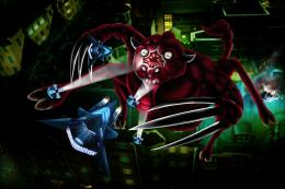 by langstrum 5237 views - final score: 58.5% | Mission Complete 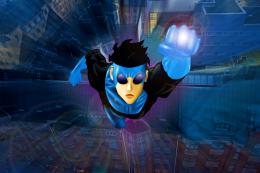 by itsdesign 6212 views - final score: 58% |
City From Below 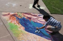 by k5683 8279 views - final score: 57.5% | Dragon 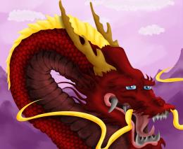 by jaescoe21 4090 views - final score: 56.7% | Curiosity 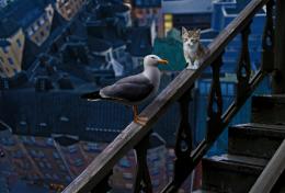 by George55 3819 views - final score: 56.7% |
I'm Pushing Buttons Fille  by Drivenslush 5448 views - final score: 56.6% | Penthouse at the Top  by artgirl1935 5446 views - final score: 56% | Here we go!  by Ressiv 3936 views - final score: 55.7% |
Fighting Demons  by Geexman 5639 views - final score: 54.3% | Modern Giant 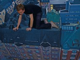 by erikuri 8025 views - final score: 53% | top view  by itsdesign 6486 views - final score: 52.4% |
Howdie Guest!
You need to be logged in to rate this entry and participate in the contests!
LOGIN HERE or REGISTER FOR FREE
very clever...but theres still seems to be something about it that stands out...maybe if you played with the levels and saturation on the 'man' layer it might help blend him more into the background pic....Good luck!
Good Idea. Author fingers need some masking.
i don't know what it is..its a good image, but there is something that isn't exactly right about it, as migue1ito said, shadow/depth maybe?
I think if his shins looked less like they're going off to the side and more like they're going down the slope of the roof, this might appear more convincing.
I think part of the problem is the white balance of the guy. Duplicate the background go to filter/blur/average. Put that layer on top of the guy and set the blend mode to color. Now reduce the opacity and ctrl click between the two layers so it only shows on top of the guy. Maybe this will help......Good idea and execution though.
This is very cool work...i like positive vibes in your image...good luck author
a dangerous entry ................
he is a dare devil......
i like it ,it is new
cool
Howdie stranger!
If you want to rate this picture or participate in this contest, just:
LOGIN HERE or REGISTER FOR FREE