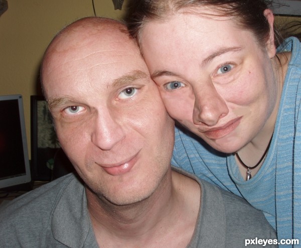
I have only used on of the images from the Wedding Album.
Thank you Rob and Lelania (5 years and 3631 days ago)
Who's the boss  by solkee 16748 views - final score: 64.2% | american gothic  by wtfayla 15212 views - final score: 60.7% | Growing Old  by Chalty669 10961 views - final score: 59.9% |
A Peek into the Future 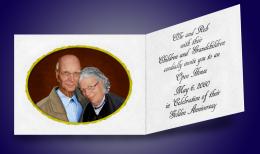 by IDt8r 11686 views - final score: 59.2% | R O B V D N 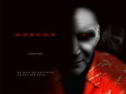 by dandesign05 9912 views - final score: 59% | Congratulations!! 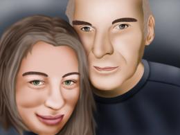 by chakra1985 4670 views - final score: 58.9% |
Beyond the Blue Horizon  by artgirl1935 5815 views - final score: 58.2% | Faceswap 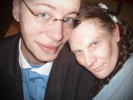 by freejay 4524 views - final score: 57.9% | Damn Paparazzi 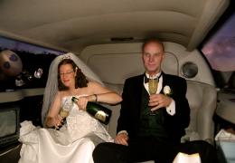 by donh 5486 views - final score: 57.4% |
Happy Married Life! 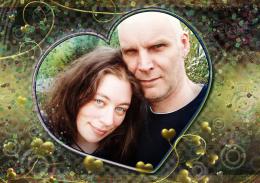 by CorneliaMladenova 5918 views - final score: 56.6% | A New Life 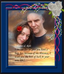 by George55 4100 views - final score: 55.6% | The Gangster Of Love  by lchappell 5607 views - final score: 55.4% |
The album 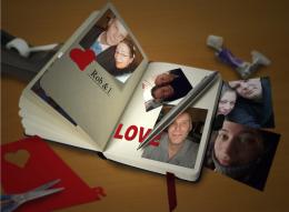 by sunzet 3864 views - final score: 54.7% | Shotgun Heard 'Round the World 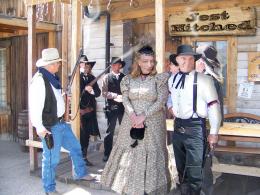 by pearlie 6654 views - final score: 54.7% | post save the date  by madelinerayne 7492 views - final score: 54.3% |
Come to me, my husband  by Torbin 5684 views - final score: 54.3% | Mod Trek  by pearlie 5813 views - final score: 54.2% | Together As ONE! 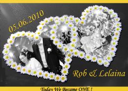 by Glam0urGirl2007 4014 views - final score: 54% |
Peppermint Hands & Brain Flea 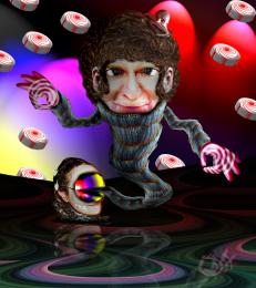 by Drivenslush 7080 views - final score: 53.8% | tendres moitier 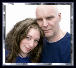 by tallyna 4467 views - final score: 53.8% | Congratulations Both Of You! 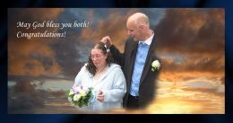 by George55 7478 views - final score: 53.5% |
Happy Married life!! 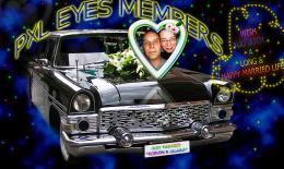 by shaiju1974 5571 views - final score: 53.5% | Mt. Rushmod 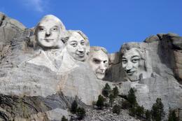 by jawshoewhah 4216 views - final score: 53.3% | in the style of e.e. cummings 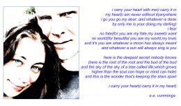 by Drivenslush 5603 views - final score: 53.3% |
We're in Heaven... 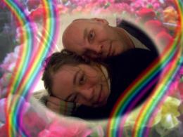 by erikuri 8055 views - final score: 51% | BuT... Who r TheY? 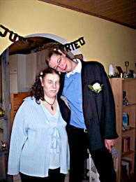 by vinshine 5188 views - final score: 50.3% | happy ending 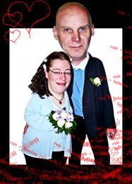 by devangel 8829 views - final score: 49.3% |
Spot the Diff 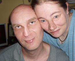 by rad54 7022 views - final score: 49% |
Howdie Guest!
You need to be logged in to rate this entry and participate in the contests!
LOGIN HERE or REGISTER FOR FREE
I would blend the nose a bit better in her face. Maybe smudge the little part by his eye and nose up a bit. Just smudge with a soft brush.
I spotted the diff, one person has a reverse tan-line on her nose :P. You can probably adjust the color using levels and maybe applying a color layer over the nose to match the skin-tone.
The disturbing effect this has on the senses is part of it's charm.. I'm very drawn to it because I can't look away... and I'm sure I want to.. hehehe.. good luck with this
Rob's face still looks natural, but Lelaina's seems a collage. Besides blending the nose, I think lips need to be flipped to match better, I don't know...
Hi
Thanks for all the support.
Well In some places i have on purpose left the parts unmatching.
the idea is the pic should look like there is something amiss. Like something that doesent belong where it is.
that was the idea.
well... but still if everyone feel i should blend them better.. i will morph and blend them again.
Thank you
Differences? What differences?

Funny idea!
I always wanted to have his eye colour anyway. Thanks for giving it to me, author
Thank you for this entry and good luck!
@Lelaina: but you have a beautiful pair of green eyes!...
I counted 63 differences so far , thanks author
nice
gud luck author ..... nice work ........
Thank you again for making this entry, Rad!
Thanks so much for entering in this contest!
We've decided to make a photobook of all the entries as a memory!
Howdie stranger!
If you want to rate this picture or participate in this contest, just:
LOGIN HERE or REGISTER FOR FREE