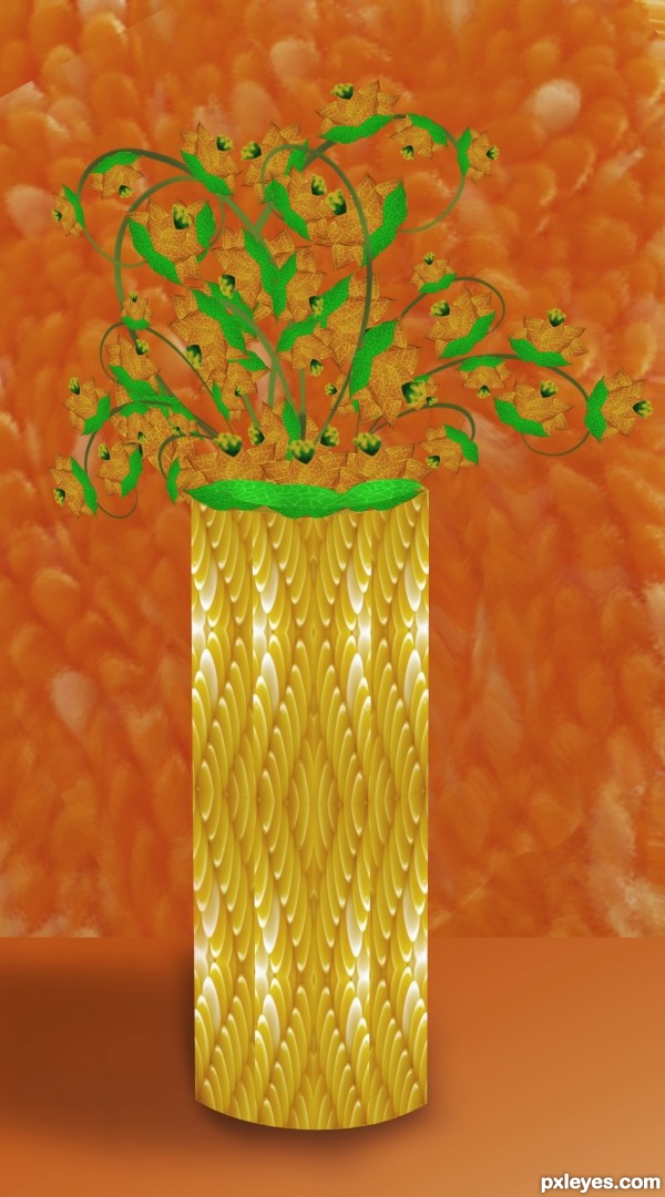
For artgirl1935 :) (5 years and 3627 days ago)
1 Source:
Andy Cornhol Butterflies  by Drivenslush 10671 views - final score: 63.7% | WORMS  by oana 10876 views - final score: 63.2% | Dino Closeup  by swordfish 12577 views - final score: 59.5% |
Pearls (updated)  by erikuri 10470 views - final score: 56.6% | CORNtv  by dandesign05 8384 views - final score: 55.9% | corn  by harvester 4859 views - final score: 53.6% |
The band that needs no intro!  by HeinrichB 7307 views - final score: 53.1% | Floral 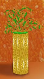 by Lamantine 4684 views - final score: 53% | Corny Couch  by Tip2Top 5719 views - final score: 52.6% |
super massive dark maize hole 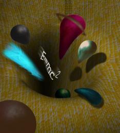 by migue1ito 7167 views - final score: 51.5% | Rainbow Corn  by BiBo 6660 views - final score: 51.4% | Corn man 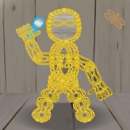 by kevinice95 4447 views - final score: 51% |
Howdie Guest!
You need to be logged in to rate this entry and participate in the contests!
LOGIN HERE or REGISTER FOR FREE
The orange background makes the orange flowers hard to see. The floral arrangement seems a bit undersized for such a large vase.
Agrees with Dan. Also, the corn vase you made, lacks depth. The shadow in front of it just gives the illusion that it's floating. I would suggest looking at an actual vase and maybe make it the same shape of a vase, but include the corn niblet texture.
Nice effort, but I agree with both. How about changing the color of the flowers?
darker shade at the bottom will help.... good luck
thanks for your suggestions, its the first time im trying this style , i will do better next time
Maybe you could spherize it a little bit... So it looks more 3D.
all the best .............
Great idea and nice work. To make your beautiful flowers easier to see, maybe next time you could use hue and saturation to change the color of the background to a more neutral color. That would let your flowers be set off against the background. As for giving the vase more rounded shape, you could use a simple gradient overlay layer style. By using that, you can set it to mirrored type gradient and use black and transparent for your colors in the gradient. You can adjust the size of the gradient as well. Keep up the great work though, I will be looking forward to seeing what you do next.!GL
Maybe you could study the color wheel. The use of complementary colors between flowers and their background will help them become the center of focus rather than the vase.
Thanks Lois I'll do better next time
Beautiful sunny colors
nice
Howdie stranger!
If you want to rate this picture or participate in this contest, just:
LOGIN HERE or REGISTER FOR FREE