
With thanks tothe following:
Playground by Agrid
Legs by klsa12
Ball by IJeyash
Boy by Annalog85 (5 years and 3608 days ago)
4 Sources:
- 1: Playground
- 2: Legs
- 3: Boy
- 4: Ball
Imagination 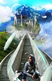 by benjaminhill12 15680 views - final score: 61.3% | Museum in the sky  by PhotoRepair 15275 views - final score: 61.1% | Dream Castle  by dreamboy 31867 views - final score: 60.8% |
The Silent Fears 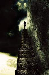 by ponti55 13727 views - final score: 59% | Amelia of Derwentwater 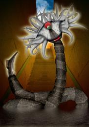 by Drivenslush 13381 views - final score: 57.1% | In the Forest  by Katka 6840 views - final score: 55.6% |
Heavens Gate 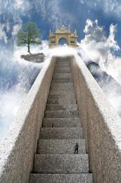 by Toothpick134 25492 views - final score: 55.6% | skater  by serialkiller 5051 views - final score: 54.7% | Losing it...  by HeinrichB 5362 views - final score: 54.2% |
Stone man  by shaiju1974 5487 views - final score: 52.7% | There is always a clear path  by alwani 10162 views - final score: 50.7% | Getting brothers ball 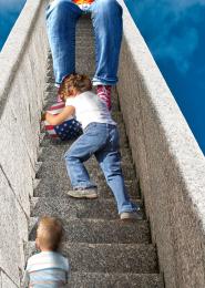 by Disco 8998 views - final score: 49.7% |
stair shaped clouds 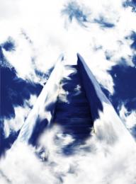 by Glam0urGirl2007 9325 views - final score: 48.3% | Lost  by tnaggar 4128 views - final score: 47.6% | Stairs to Atlantis 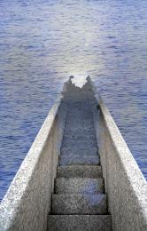 by james405 12158 views - final score: 47.4% |
Howdie Guest!
You need to be logged in to rate this entry and participate in the contests!
LOGIN HERE or REGISTER FOR FREE
its a nice image but there are a few odd things about it... the lighting of the steps doesn't match the light cast on the figures (maybe flip the steps horizontally) i dunno if you meant to do this but the perspective is way off, as the figure on top should be much smaller. also since im picking nits, the child with the ball looks transparent around the boarders
Krystian - that's one mighty comment! - so one by one - the lighting on the steps - yes, but the figures have been flipped so much that they are dizzy! - well the little girl is anyway! Regarding the perspective, well, I'd love to say "yes I wanted it like that" but that would be lying! I'm not good with perspective, but on the whole I didn't think this one was too bad? (Obviously it is...) I will point out that the figure at the top is an adult and therefore meant to be bigger. And lastly that poor transparent child-yes you're right she does look it ,but honestly - she really isn't!
Nice concept, but the tiny steps at the top of the image don't really match Papa's big butt. Also the right-side railing's shadow that nearly covers the stair steps is at odds with the lighting of the upper two figures. And the left railing seems higher than the right railing which is unexpected.
DanLundberg - I see the small steps and the big butt......but - he had to squeeze himself on there to keep an eye on the children! The rest of your comments I take on board. Oh, and I owe an apology to Krystian - poor child WAS a bit transparent, I've doubled her up now and given her a good meal - she looks better now I think. She says she certainly feels better......
nice idea ........
Your biggest problem is that the dad is sitting with his ass like 12 steps higher than his feet are. So his legs are about 4-5 meters long?
Ressiv said ass... giggle snort.. Very nice concept author.. good luck!!!
GL to you!!
Howdie stranger!
If you want to rate this picture or participate in this contest, just:
LOGIN HERE or REGISTER FOR FREE