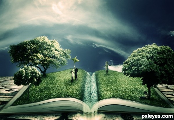
Ahhh... Photoshop was constantly crashing today and I lost the Step by Step guide.. I ended up re-doing the entry about 3 times. Well i hope it was worth it :/
Thanks to Jesuisautre (5 years and 3595 days ago)
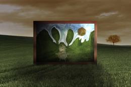
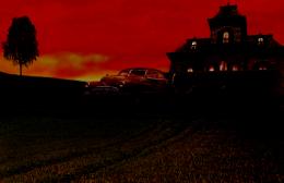
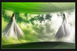
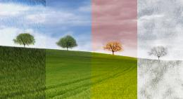
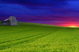
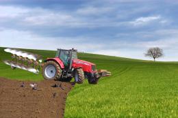
- 1: Book
- 2: Water Texture
- 3: Tree...
- 4: Tree 2
- 5: Another Tree
- 6: Children flying kite
- 7: Child sitting by tree
- 8: Jumping Child
- 9: Floor
- 10: Sky

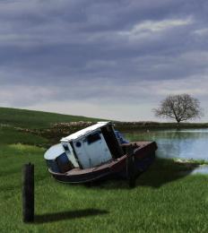
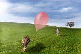
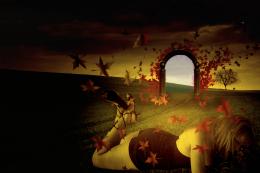
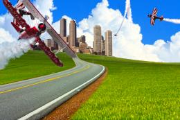
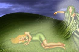
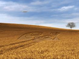
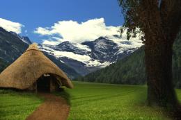
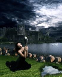
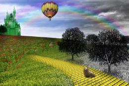


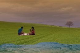


another excellent entry
Shoulda known it was you....fantastic work. Beautiful color scheme. Very imaginative and almost "fairy-tale-ish" Is that a real word? You know what I mean!!!
awsome!!! ... great inspiration and motivation to try to do something better..
Yep, reading can open our minds and grow our imagination!... You really got to show us the meaning of reading good things! Nice entry, author!
Great job
great as always......
Ok... this is great! and I mean REALLY great. The idea, and composition is... can I say great again?. You have some issues w/ lighting but over all, color me impressed. REALLY original.
Holy crap Author! Way to step out of the box. Awesome image and I didnt guess it was you first.
yes the image you have done is really good
but the idea is not yours
its a tutorial... i don't know but i have seen it somewhere
otherwise good efforts you have put in there author
Thank you all very much for the support! I didn't think that many people would actually like it.. Ankitsuhaill, i created this image myself, i used no reference tutorials or images, I give you my word.
Edit: The closest i came to using a reference was Lelaina's "The Magic of the Written Word"
http://www.pxleyes.com/photoshop-picture/4a8b0e00ec014/The-magic-of-the-written-word.html ... this was the image that inspired the idea.
Very nice idea! Whether it's from a tutorial or not. Just a few things; The grass in front is kinda ugly blurred. Can you keep that as sharp as the grass in the back? Also the blending with the book in the front is a little unsharp. Sharpening the edges around the grass would make it a lot better. Where is the water source, in the middle? In that case why is it white? if it's supposed to be water make it blue and ripple the grass thats in the water Good luck!
hey please author don't take my comments in a wrong way....
i am very impressed by your work...seriously i am...
i just said about the idea that was from a tutorial but it is not certainly a copy of that and you have done much better than that tutorial
just fix some small errors like lighting
and you are on the top of this contest....
my wishes
Great work author ... Good luck! =) Fav !
This is really good. This could be great with a bit more work. The grass should extend the page on the left the same as it does on the top. The grass should also have a sharp edge on the bottom of the book. The water needs a lot of work, it also needs sharper edges where it meets the book and also between the underwater and above water part. At first I really didn't know what the water was, perhaps having the water pour off the page or just adding a duck would help. The shadows need more attention as well. Overall this is a nice entry which will score high, but with some minor adjustments this has the potential to be one of the greats. Good luck!
great finish
I'm speechless... thanks to ALL of you for your comments and your advice.. Chalty and Ressiv in particular, i've sharpened the grass, removed the soft edges at the bottom, added a waterfall falling from the centre. I hope it looks better this way.

Again, thank you all so much! I never expected this entry to do well...
Very good! Just one last thing, the water kinda spoils the image for me. Try to create horizontal waves in the waters structure, the structure is really weird now. You could do it with the smudge tool, stroking horizontally. And in the front where the water is going over in a waterfall smudge a little vertically so that the water really looks like its transforming into the waterfall. Nice concept anyway! Good luck!
Fabulous work author...good luck
ooohhhhh dear. i'm enthralled. you've blended and worked the sources so well together. you've captured my full attention. i can't say anything that someone else hasn't already say, except...wow. just pure ..wow.
Well worth it... GL
GL
Great work author. Nice blending of images
 .
.
Love your idea, very creative, gl author.
good work
This actually rocks! best entry in my opinion and yeh, slightly off your normal track but i knew it was you specially when i read the style of the authors comment! :P nice work dude!
Really magic image!
Lol and congrats on 2nd as well.
Congrats!! Great job!
Let me say, that I'm really honored, that one of my entries was the inspiration for this fantastic entry!
Congrats for the second place!
In spite of PS crashing, you were rewarded! Congrats!
Howdie stranger!
If you want to rate this picture or participate in this contest, just:
LOGIN HERE or REGISTER FOR FREE