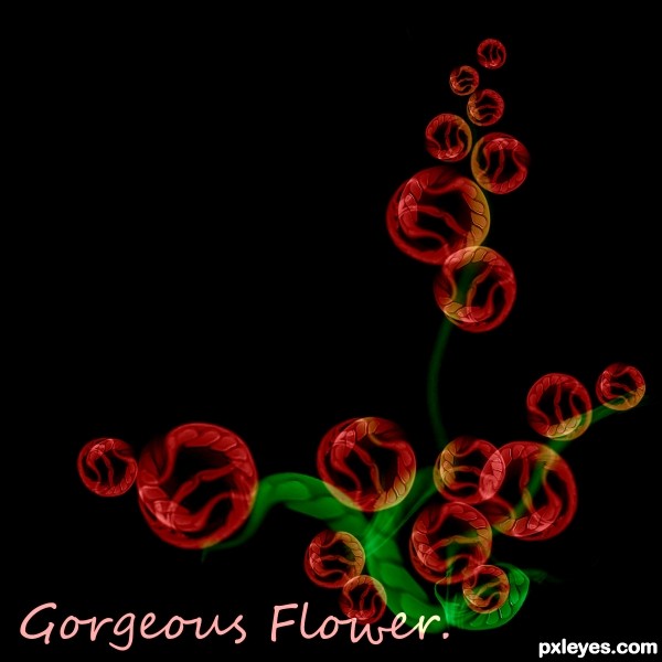
Just make it simple...
(5 years and 3596 days ago)
Number FUN! 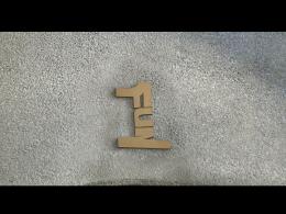 by bjaockx 8830 views - final score: 57.6% | 2 Is Better Than 1 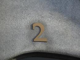 by chrispomerleau 6642 views - final score: 56.1% | The 1 That Didn't Get Away 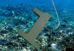 by HeinrichB 8892 views - final score: 52.7% |
Binary Universe  by ganjagoddess 7069 views - final score: 52.6% | One Chance 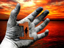 by HeinrichB 6218 views - final score: 52.4% | number 1 running championship 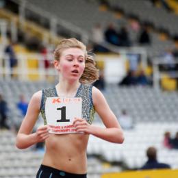 by radeon21 8241 views - final score: 52.2% |
Together one 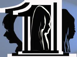 by vosya 3428 views - final score: 52% | Gorgeous Flower  by Dounge 4632 views - final score: 51.6% | matrix  by quill 3079 views - final score: 51.2% |
The 1 Desert  by Joenn 5404 views - final score: 50.7% | Optical Illusion  by Joenn 11220 views - final score: 46.9% |
Howdie Guest!
You need to be logged in to rate this entry and participate in the contests!
LOGIN HERE or REGISTER FOR FREE
You CBR'd the source. (chopped beyond recognition) You could have made this image with anything. It defeats the purpose of a source image contest. The text doesn't look good either. My suggestion would be to remove the text and try to add more of the source image into it.
It's beautiful, but I have to agree with Jaw. For this work you could have used any other image than this no. 1. And you used the wall... So, when you have a source image, like this contest, you have to work on it, since the image is recognizable (even distorted).
gl
it's true that you could have used other images to achieve this, but I really like the outcome anyway!
Howdie stranger!
If you want to rate this picture or participate in this contest, just:
LOGIN HERE or REGISTER FOR FREE