thanks to bberburb, HSmade and th3ph17 for the stocks. (5 years and 3562 days ago)
Whats eating you today Norman?  by Geexman 9452 views - final score: 57.6% | cat in boots  by serialkiller 12084 views - final score: 57.5% | What?...I didn't do it!  by Geexman 6722 views - final score: 57.3% |
Gold 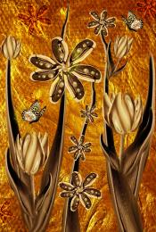 by Cherish 7181 views - final score: 56.5% | This Is Our Life  by ponti55 6612 views - final score: 56.3% | Funnyface  by lahiripartha 2916 views - final score: 55.9% |
Shameful  by JPDesigns 5812 views - final score: 55.5% | What Happened To The Ark 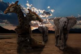 by Christy 6531 views - final score: 55% | Girl  by mounirupa 3862 views - final score: 54.5% |
I Hated Ayn Rand  by Drivenslush 4497 views - final score: 51.1% | backofgirl  by neeraj55 2428 views - final score: 50.2% |
Howdie Guest!
You need to be logged in to rate this entry and participate in the contests!
LOGIN HERE or REGISTER FOR FREE
Photography and photoshop contests
We are a community of people with
a passion for photography, graphics and art in general.
Every day new photoshop
and photography contests are posted to compete in. We also have one weekly drawing contest
and one weekly 3D contest!
Participation is 100% free!
Just
register and get
started!
Good luck!
© 2015 Pxleyes.com. All rights reserved.


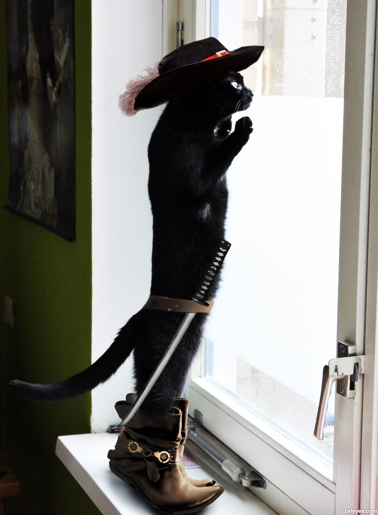
Hehe, very nice idea! My suggestion would be to reduce the saturation of the yellows and reds on the boots, the colour cast clashes with that of the background image. Good luck!
Pretty clever.. I know the boots aren't meant to fit, but they're still a bit TOO large for my taste. A bit more work with the colours and stuff and it'll be very good.
Haha good idea
I changed the color of the boots. I hope it is better now. I would like to hear your opinion. Also I have added some shadows over the belt and the sword (may be more visible in high res). Anyway, I like the size of the boots and decided not to change it for now. Thanks for your comments and suggestions.
How about increasing a bit the contrast of the cat's image? I think its colors are a little "rinsed out", comparing to the boots and hat. But it's a very cute entry.
ahahahah very cool
Thanks for the suggestion erikuri. I have changed the contrast a bit and I think it really is better now.
Much better now. I still disagree about the boots, but I won't punish you for having your artistic freedom with that. The fur looks better with higher contrast and the shadows too. You could give a very slight burn tool or something for the belt edges and if you could make the sword blade just a bit more sharp and clean looking, it would help too. Good job with the improvements..
so cool...
Very cute and great use of the source!
Congrats for 2nd
Congrats!
Congrats for your second place!
Thank you!
Howdie stranger!
If you want to rate this picture or participate in this contest, just:
LOGIN HERE or REGISTER FOR FREE