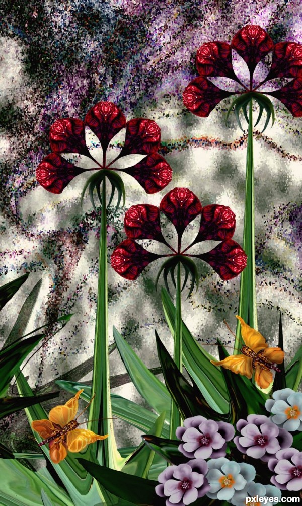
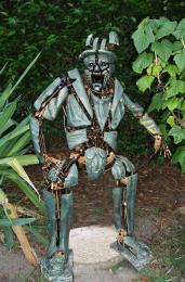
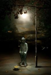
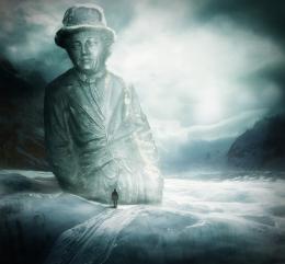
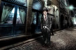
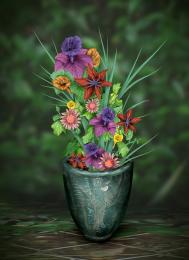
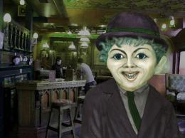
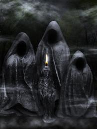
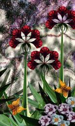
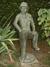
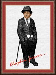
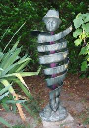
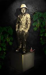
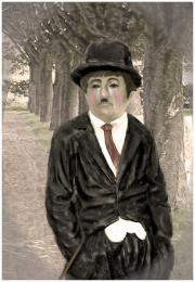
Everything was done using the source photo. Flowers and butterflies are stylized rather than realistic. Butterflies (you've got to look up close) are made from statue face. Red flowers are from top of his pants, and plants leaves from green plants in source. This entry took a lot of time since I used a trial of CS5 and have really struggled with it. Much different than my Adobe 6 program!!!! (5 years and 3558 days ago)



lots of work we can see here...very very nice entry....i adore this gold-ish butterfly's...best of luck
That's not the best of your works but its beautiful as always
really cool entry!
cool....
I like what you have done, the smaller corner flowers are great, butterfly’s are a little too stylized but work well within the scene.The only thing that dose not work for me on a personal level are the red flowers mainly because they lack form, but have a lot of potential.
Only a great artist could make a great work like this one.
I don't generally appreciate pictures from where you can't see almost nothing of the original source. But a lot of skillful work, nevertheless. If you would warp the white petals/leaves of red flowers it would look better, they're so even and artificial looking right now. Very nice outcome, as always..
very nice entry
Thanks for the comments. I appreciate each one. Folks, if you read description above, these flowers are meant to be very stylized since the butterfly actually has 3 images of chill in it, therefore has to be more of a stylized design. The red flowers are a study in negative and positive design, and white flowers are as realistic as possible taking into account the overall design. Thanks again for your comments.
Howdie stranger!
If you want to rate this picture or participate in this contest, just:
LOGIN HERE or REGISTER FOR FREE