Only one external source used (5 years and 3539 days ago)
1 Source:
resting place  by Chalty669 11712 views - final score: 60% | The Snowy Owl  by GarethWaring 18958 views - final score: 58.7% | butterworld  by jack2 10157 views - final score: 56.9% |
Red Bird  by lahiripartha 9540 views - final score: 56.7% | Butterfly colection 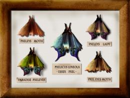 by beocity 16321 views - final score: 56.5% | Flowers  by nasirkhan 5735 views - final score: 55.9% |
Pencil Flower  by mounirupa 7253 views - final score: 53.8% | I love you (updated) 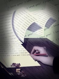 by erikuri 5639 views - final score: 52.8% | pencil shavings  by Glam0urGirl2007 6774 views - final score: 52.7% |
Ham Sandwich 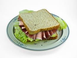 by oasisman 6279 views - final score: 52.2% | shaving flagg  by sweeto1twity 4699 views - final score: 52.1% | Butterfly 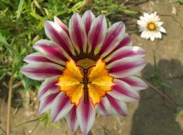 by theudulf 5569 views - final score: 51.9% |
Abstraction 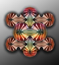 by Alan2641 3544 views - final score: 50.2% |
Howdie Guest!
You need to be logged in to rate this entry and participate in the contests!
LOGIN HERE or REGISTER FOR FREE
Clever idea. Well done!
nice
Very good entry!
Very creative and curious idea.
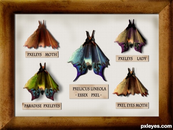
Very creative, but the butterflies/moths look flat, not three-dimensional. Some Burn Tool on the bodies and refinement of the shadows falling on the background (different parts of the moth would be different distances from the background and thus would cast a slightly different shadow) would help. A stick pin through each moth might add to the realism.
Hi, everyone!¨Thanks for the comments!
 ))) I made the pins and in the end decided not to use them, I couldn't stab the poor creatures!
@ DanLundberg
I didn't want to touch the original texture much but, you're right, some things should be improved. I uploaded it and decided to see what the others would have to say . I appreciate your suggestions and, yes, burn tool just might be the best solution for the "fake" inner shadows. i will try to improve that part!
And as for the pins- sorry, i just couldn't!
Great idea author,i like your different approach to this contest...well done
thanks, erathion!
 ). I did my best to achieve a more 3D effect and I think it looks better. I also used both burn and dodge tool to add the same effect to the frame. Then i added some smudges to the background and to the tags- i thought it should be older!
I made some changes! DanLundberg, thanks again for the suggestions- burn tool really did do the trick (I don't think I use it nearly as often as I should
Anyway, I appreciate your inputs! Thanks!
i like it !!!!
I think there's some more depth now. BTW if you create a selection beforehand, that constrains where your burning occurs so you can easily get hard lines between burned and unburned areas..
Congrats...this is really really cool work...
Howdie stranger!
If you want to rate this picture or participate in this contest, just:
LOGIN HERE or REGISTER FOR FREE