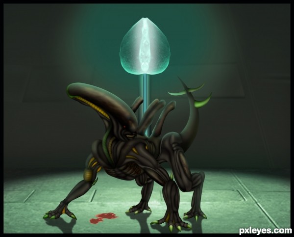
Only source image used...For making this entry i created 586 separate layers,personal record....:)
Please watch high resolution before voting...Thanks (5 years and 3542 days ago)
the crab  by PXLEyes 17536 views - final score: 63.8% | Crystal Guardian  by erathion 15173 views - final score: 62.4% | Emerald protector  by SOLARIS 16087 views - final score: 62.1% |
it's time 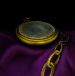 by RickyRuckus 13116 views - final score: 60.9% | Bonsai 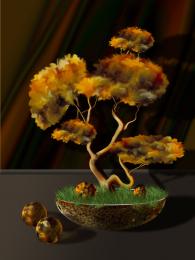 by George55 13938 views - final score: 60.3% | Humming Bird 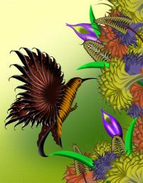 by Siddhartha 6131 views - final score: 59.1% |
Butterflies N' Amber 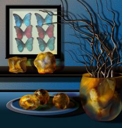 by George55 6074 views - final score: 58.9% | the aura  by dekwid 4322 views - final score: 58.6% | Caught in the rain  by GarethWaring 8324 views - final score: 58.6% |
At the Flats  by Drivenslush 4049 views - final score: 56.2% | OLD  by Glam0urGirl2007 4451 views - final score: 55.2% | Bowling Fruit 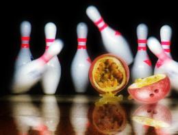 by oasisman 11253 views - final score: 54.1% |
Im sure my grandpa saw this :) 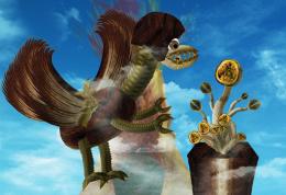 by kevinice95 8925 views - final score: 53.9% | new species 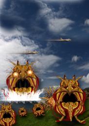 by jack2 4311 views - final score: 53% | The beauty in passion forest 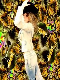 by bingbong088 6920 views - final score: 49.8% |
No Passion For This Fruit Head 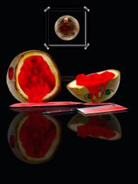 by Chuck 10680 views - final score: 49.1% | light 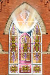 by ONabil 3854 views - final score: 47.6% | be careful 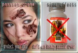 by jack2 4226 views - final score: 47.1% |
Fruit is Murder 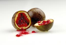 by NoxMagus 10921 views - final score: 45.9% | all passion...  by nonotkrov 6560 views - final score: 44.6% | Villain  by silencer32 4298 views - final score: 44.2% |
Howdie Guest!
You need to be logged in to rate this entry and participate in the contests!
LOGIN HERE or REGISTER FOR FREE
One of your best . The anatomy of this creature is just awesome! I suggest to do a bit more lighting, especially the side highlight, and darken the center part of the creature (which should be in the shadow area), so it will look more 3D. Also the shadow on the ground is not really accurate, but it's difficult to explain, it should be distorted more and straighten along with the light direction. This image is very potential, good luck my friend
fantastic entry, & I agree with langstrum .... slightly darker shadowing on the body near the back leg will make it pop out nicely....very well done author!
a great entry.am envy by ur creation...it really nice..
I do like how you take the source and create stunning new images. Not sure if the creature is a touch too sharp for the background? The blood is blurred but in the same focal plane? I would also tweak the shadows that are not touching the feet close enough. Still very very well done! Keep up the good work.
amazing! great colours!
W.O.W. That's all I can say. I agree with Langstrum...the anatomy here is awesome! Amazing work!
Wonderful work author . Some lighting and contrast work will boost your character
Great job, but there are a lot of parts with jagged edges and/ or white edges that need blending and smoothing. Also, one of the tube things on the creature's back is in front of it's face, and they don't look convincingly attached to the body.
I am very happy that it's you my friend., it's a brilliant and clever stuff.., hat's off for you..,
very cool work!
Thanks a lot for the nice comments and great suggestions guys,i made some changes,damn slight changes take me 3 hours... .....Again thanks for very very and helpful advices...
Simply fantastic! It seems it can walk on 4 and 2 legs as well. The anatomy is perfect (according to our imagination). and the crystal... the glow of the crystal is very realistic, it looks like a real gem for me. Amazing work, I'm sure it's top 3! GL!...
Great job......... wish u high marks ........
well done !! great work .. good luck
excellent perspective, amazing floor work, high marks to you.........
AWSOME ENTRY......!!!! WELL DONE AUTHOR....!!!
I'm probably missing it, but where does the source image come into play? Great job, btw. =]
Source image is used for some body parts of the creature and for the crystal...all is in SBS...
Oh my goodness, lol. I'm so sorry. I read the guide, it was amazing. You have such a beautiful talent. =]
Nice
Very nice! The floor is a good construction (minot thing; it's little pixelated). The shadows on the ground are all 100% vertical, but for example on the left paw the light comes from the right top, so the shadow should be pointing towards the left bottom, not straight down. Overall the creature is a very nice construction!
I want the crystal so I must get into battle
nice
(from the movie ALIENS)
Bishop: Not bad for a human.
Hudson: Let's just bug out and call it even, OK? What are we talking about this for?
Ripley: I say we take off and nuke the entire site from orbit. It's the only way to be sure.
Hudson: F#ckin' A...
Burke: Ho-ho-hold on, hold on one second. This installation has a substantial dollar value attached to it.
Ripley: They can *bill* me.
Ripley: [referring and looking into the empty doll head] Look, no bad dreams there.
Newt: Ripley, she doesn't have bad dreams because she's just a piece of plastic.
hehehehe
Congrats! for 2nd

Neb, didn't I say this work would be in top 3? Congratulations!
Congrats ...........
congrats erathion.

Congrats!!
Congratulations! Good job!
Howdie stranger!
If you want to rate this picture or participate in this contest, just:
LOGIN HERE or REGISTER FOR FREE