(5 years and 3534 days ago)
To Let 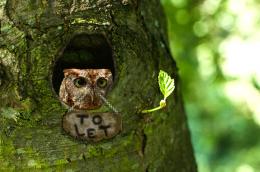 by olseado 12215 views - final score: 55.5% | New Start 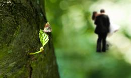 by blindscientist 12502 views - final score: 54% | hidden gate 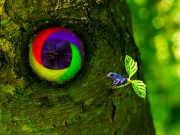 by cabldawg71 10333 views - final score: 53.9% |
hanted tree 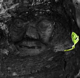 by Glam0urGirl2007 7475 views - final score: 53.4% | tranquility 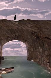 by lvstealth 6924 views - final score: 53.4% | Against All Odds 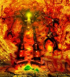 by EmiK 9903 views - final score: 53.3% |
take a left at the bee tree 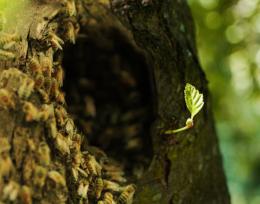 by RickyRuckus 8394 views - final score: 53.1% | Tiny Leaf and the Bird's Nest 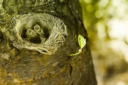 by dgraphicrookie 13794 views - final score: 52.6% | Homeward Bound 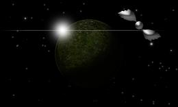 by blindscientist 4174 views - final score: 52% |
Lady Ent  by alexriv 9297 views - final score: 51.2% | FOCUS 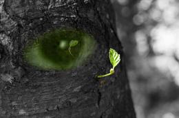 by nonotkrov 4916 views - final score: 50.2% | You MISSED ME 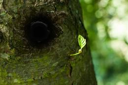 by nonotkrov 6119 views - final score: 49.9% |
Howdie Guest!
You need to be logged in to rate this entry and participate in the contests!
LOGIN HERE or REGISTER FOR FREE
Very creative. You really went above and beyond on this one. Great job!
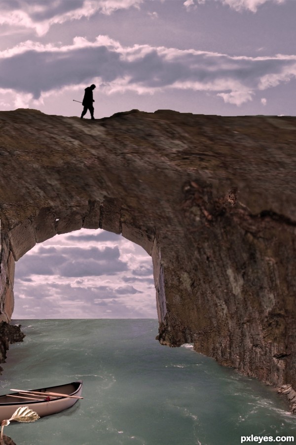
The upside down clouds look weird, and the leaf is so far in the foreground that it wouldn't have that shadow. Good effort otherwise.
Plus, the top of the arch looks incredibly blurry...too much to ignore. And there seems to be a little bit of a transparency crack on the right side. I also agree with CMYK. But definately, nice effort and great idea.
CMYK, I took the shadow out, I will find other clouds, meanwhile i flipped them right side up. thanks for the help.
gamemastertips, the top of the arch? do you mean the part of the tree over the arch? it is the source image. can you give me more info, i dont see a transparency crack? (Sometimes cause i have looked so long and hard i dont always see things) to the right is just the tree. thanks for your comments.
edit: are you talking about the spider web? i liked it! do you think it should go?
Oh okay, maybe it is a spider web, then. What I mean is that there's an incredible difference from the very sharp base of the arch to the very blurry top half that I believe is the texture from the tree.
I agree with gamemastertips - the blurry top of the arch is distracting, although I know it is part of the source. Perhaps add another rock texture and blend it in? Otherwise, cool idea, and nicely executed. Good luck.
ok guys, not sure it makes it better, but i changed it some, let me know
It's still blurry... I suppose it happened when you stretched the image of the trunk on the arch.
lol! no erikuri. i didnt stretch it. oh wow. didnt you see the source? it IS blurry. i didnt do anything to it to MAKE it blurry. to try to help it (because of the comments) i did do some work on it, and now it is less blurry. i really didnt want to change the tree at all since it is the source and i was really trying to do a creative use of it by turning it on its side and using the knot hole as a waterway.
i like it
thanks everyone!
Howdie stranger!
If you want to rate this picture or participate in this contest, just:
LOGIN HERE or REGISTER FOR FREE