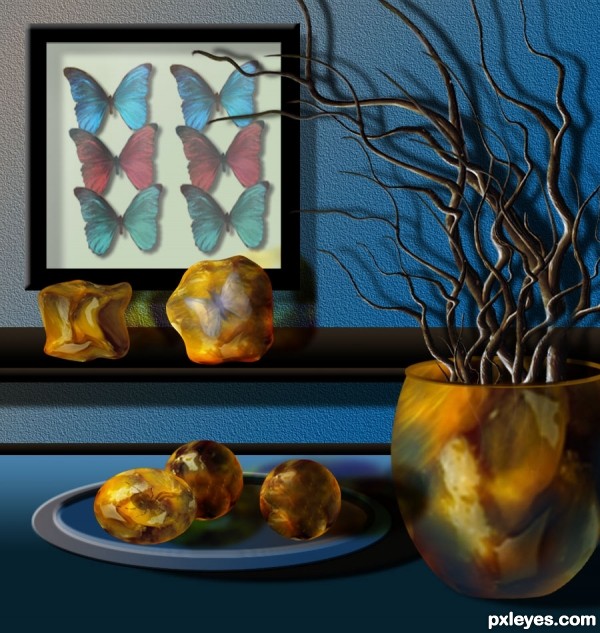
Thanks to Clinge, for the pic of the blue butterfly.
Thanks to mqtrf, for the pic of the spider.
The rest is PS and imagination. (5 years and 3542 days ago)
2 Sources:
the crab  by PXLEyes 17539 views - final score: 63.8% | Crystal Guardian  by erathion 15177 views - final score: 62.4% | Emerald protector  by SOLARIS 16095 views - final score: 62.1% |
it's time  by RickyRuckus 13117 views - final score: 60.9% | Bonsai  by George55 13941 views - final score: 60.3% | Humming Bird  by Siddhartha 6133 views - final score: 59.1% |
Butterflies N' Amber 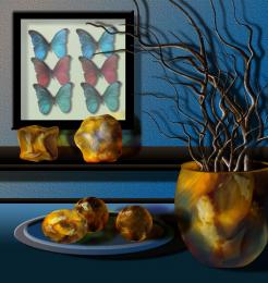 by George55 6077 views - final score: 58.9% | the aura  by dekwid 4326 views - final score: 58.6% | Caught in the rain  by GarethWaring 8328 views - final score: 58.6% |
At the Flats  by Drivenslush 4051 views - final score: 56.2% | OLD 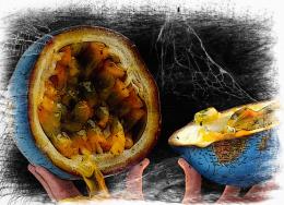 by Glam0urGirl2007 4453 views - final score: 55.2% | Bowling Fruit 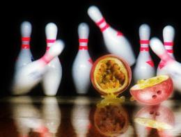 by oasisman 11257 views - final score: 54.1% |
Im sure my grandpa saw this :) 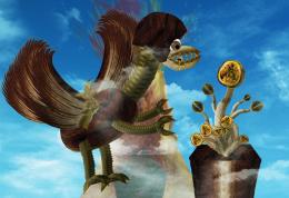 by kevinice95 8933 views - final score: 53.9% | new species 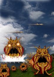 by jack2 4314 views - final score: 53% | The beauty in passion forest 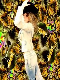 by bingbong088 6923 views - final score: 49.8% |
No Passion For This Fruit Head 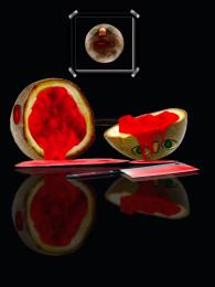 by Chuck 10684 views - final score: 49.1% | light 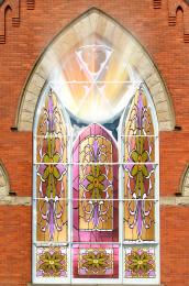 by ONabil 3856 views - final score: 47.6% | be careful 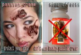 by jack2 4229 views - final score: 47.1% |
Fruit is Murder 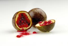 by NoxMagus 10926 views - final score: 45.9% | all passion...  by nonotkrov 6562 views - final score: 44.6% | Villain  by silencer32 4300 views - final score: 44.2% |
Howdie Guest!
You need to be logged in to rate this entry and participate in the contests!
LOGIN HERE or REGISTER FOR FREE
most distinctive work ! good luck
Fantastic! Amber is so realistic... Everything is perfect. Just one thing: the vase needs to cast a shadow, doesn't it?
Thank you for comments. Erikury...my monitor is kind of dark, and did not see that right bottom where the vase is standing.... I will add the shadow altough probably it can not be seen, probably I lower the light on the table, to a softer kind of blue... you are right, I will do that.

UPDATE: Added shadow and lowered gradient, so, the shadow can be seen.
I find it odd how some stray shadow is being cast onto the vase from the left as if it were a flat object...otherwise, you did an awesome job. Very creative and well executed.
very nice work author,construction of the elements is great...good luck
Source?
Thank you again for comments.

Gamemastertips: Shadow...corrected.
Perfectchaos: The source for this entry is the "Passion Fruit" picture, I added outside stock, from pxleyes stock pictures. Check my SBS please.
I really like the colors and the way you made the bugs in amber look. Nice job!
The amber is beautifully done
awesome work author! (as usual!)
Howdie stranger!
If you want to rate this picture or participate in this contest, just:
LOGIN HERE or REGISTER FOR FREE