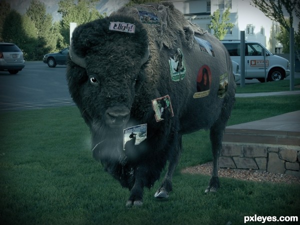
"Take those stickers off of me! It's getting cold, I'm going home..."
Thanks to V~Man and Royalty-free image collection @ Flickr. (5 years and 3520 days ago)
Freeze! 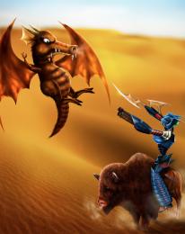 by langstrum 7478 views - final score: 63.8% | Thats no Bull!! 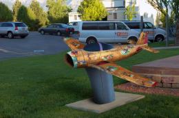 by IRONCOW 11132 views - final score: 61.6% | Utah Desert  by George55 8781 views - final score: 60.1% |
Robot? 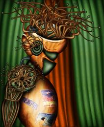 by chakra1985 7063 views - final score: 60% | Pottery 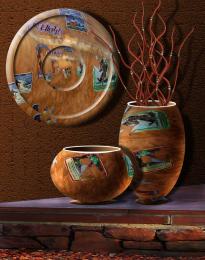 by George55 6683 views - final score: 59.7% | Morning Playtime  by IDt8r 4558 views - final score: 58.9% |
bird eye view  by dekwid 3685 views - final score: 58.8% | Stolen! 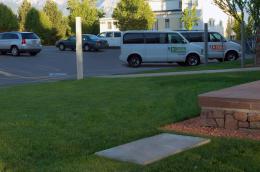 by Chalty669 4048 views - final score: 58.7% | The Watering Hole Carving 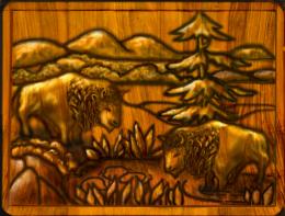 by artgirl1935 6730 views - final score: 57.8% |
Bison goes home 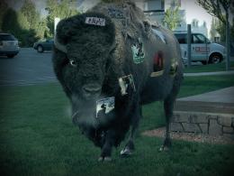 by erikuri 7881 views - final score: 57% | Elephant  by nasirkhan 3610 views - final score: 56.4% | Voodoo Can-can Balais Taboo 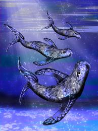 by Drivenslush 7680 views - final score: 56.2% |
Buffalo Hunt 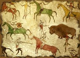 by artgirl1935 8352 views - final score: 56% | WE QUIT!!!!!! 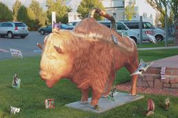 by IRONCOW 3966 views - final score: 55.9% | Evil Island 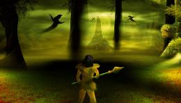 by suresh 6692 views - final score: 54.9% |
Golden Buffalo 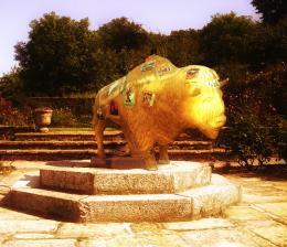 by nasirkhan 5249 views - final score: 52.7% | Life Yet Untouched by Tragedy 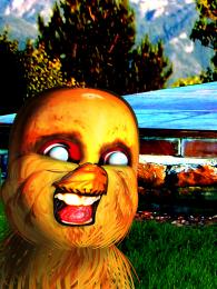 by Drivenslush 6672 views - final score: 52.7% | Interplanetary Bison Souvenir 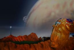 by lchappell 5490 views - final score: 52.4% |
Arbustes 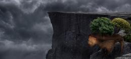 by Lamantine 3199 views - final score: 52.1% | Buffalo Benjamin Grimm 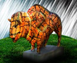 by Drivenslush 5443 views - final score: 51.8% |
Howdie Guest!
You need to be logged in to rate this entry and participate in the contests!
LOGIN HERE or REGISTER FOR FREE
nice blending looks quite real -- might lose the winter playground sticker -- looks a bit odd (IMHO)
Kudos for not going the CBR (chopped beyond recognition) route. Nevertherless: Seeing the contest source, I can appreciate how one might imagine "what if a real bison traveled around the Utah area and came back home with stickers on itself from where it went?" Overlooking why anyone would find the end result particularly interesting outside the context of this contest, it's curious that 'home' is a small, rectangular slab beside an urban parking lot. The rear stickers look more realistic that the front ones. The shadow is weak right under the hooves where it needs to be strongest in order to anchor the bison to the ground. It's not clear what the 'glow' in the 'beard' area is supposed to represent.
Very nice work and great blending.

@ Dan IMO glow is here for showing him angry
A random thought -- New title: Where the Buffalo Roam. Description: "Excuse me. I'm visiting from out of town. Where do the deer and the antelope play?"
Good blend of the 2 images...might be better to remove the statue base. I think he's meant to be snorting judging from the foggy area around the nose? Might want to rethink that...
SBS say: -It's his breath! He does say he's getting cold ,so you probably would see his breath?
Nice, guys! We can see bison's breath as an angry sign. As a scene like this (a bison full of stickers) is unlikely to happen, let's think of it this way: maybe it was bewitched, like a statue. But the witchcraft was broken, and it turned to life, and wishing go home. In a bit cold day, many times our breath can't be seen, but a breath of a huge animal like a bison can.
nice idea.. ,
Author, that's a good explanation so far, but why is the statue base still there?
@Bob: I would say to you to pretent that it was a sewerage system lid!...

But I made the changes you suggested. Well, I hope it's better now.
While it's a bit disconcerting that the author isn't sure what the image is about ("...maybe..." , replacing the concrete slab with grass is a definite improvement. I think the middle-hoof shadow should be tilted slightly (8 o'clock to 2 o'clock) to better match the perspective of the ground.
@Dan: thanks! Of course, it was the base of the statue. As CMYK asked why the base was still there, I said that.
About the shadow, I think it's similar to source 1...
Great blend author,buffalo is amazing>Its always hard to achieve good blend of 2 or more animals,but u score there...well done
great job ! good luck
Looks good GL!
look great nice image
Author, I think you did a good job on the blending. It looks real good over all. Good luck.....!!!
Howdie stranger!
If you want to rate this picture or participate in this contest, just:
LOGIN HERE or REGISTER FOR FREE