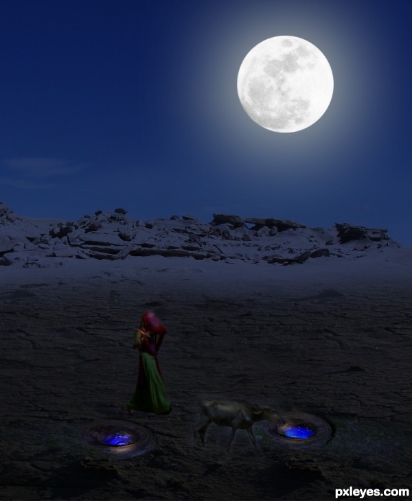
(5 years and 3497 days ago)
Fallen  by telmafrancione 8984 views - final score: 57.4% | Butterfly Faerie  by samvio 13543 views - final score: 56.5% | Narcisus  by telmafrancione 8817 views - final score: 56.3% |
MOUNTAIN 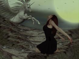 by DYNOSSAURUS 7058 views - final score: 55.8% | Home 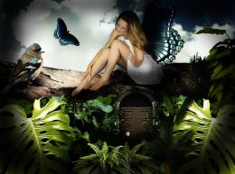 by telmafrancione 5962 views - final score: 54.6% | This new house is so heavy...  by nevena 7183 views - final score: 52% |
Desert 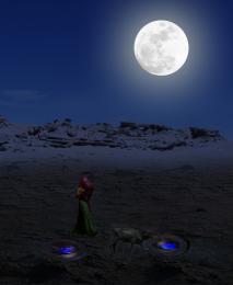 by nevena 3286 views - final score: 50% | Transformed  by Blayz 2917 views - final score: 50% | Mr. Lonely  by bingbong088 5780 views - final score: 48.4% |
Howdie Guest!
You need to be logged in to rate this entry and participate in the contests!
LOGIN HERE or REGISTER FOR FREE
forgive me if I`m mistaken but I cant see the broken branch image, the idea is to incorporate the source image provided
Look better It's dark out there... Holes and surrounding are from the source image.
Not bad, but it looks like that most elements in the image receive light from the right side. Therefore I think it would be more logic that the moon would be placed more in the right corner too (for being the biggest lightsource). Good luck!
Sorry,,, but,,,, one SBS would be good.... I can't see the broken branch image too.
Howdie stranger!
If you want to rate this picture or participate in this contest, just:
LOGIN HERE or REGISTER FOR FREE