Just source image, used in the making of this entry. (5 years and 3513 days ago)
Freeze!  by langstrum 7471 views - final score: 63.8% | Thats no Bull!! 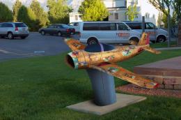 by IRONCOW 11121 views - final score: 61.6% | Utah Desert  by George55 8771 views - final score: 60.1% |
Robot? 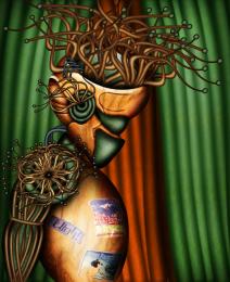 by chakra1985 7056 views - final score: 60% | Pottery 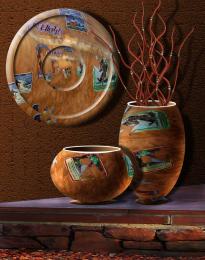 by George55 6673 views - final score: 59.7% | Morning Playtime 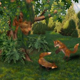 by IDt8r 4551 views - final score: 58.9% |
bird eye view 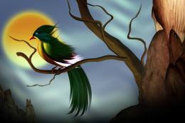 by dekwid 3683 views - final score: 58.8% | Stolen!  by Chalty669 4045 views - final score: 58.7% | The Watering Hole Carving  by artgirl1935 6723 views - final score: 57.8% |
Bison goes home  by erikuri 7871 views - final score: 57% | Elephant  by nasirkhan 3605 views - final score: 56.4% | Voodoo Can-can Balais Taboo  by Drivenslush 7670 views - final score: 56.2% |
Buffalo Hunt 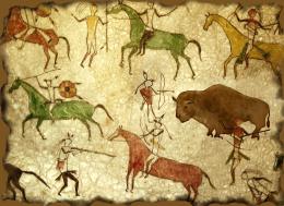 by artgirl1935 8346 views - final score: 56% | WE QUIT!!!!!! 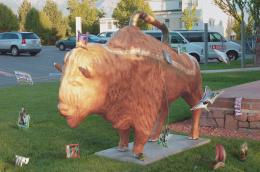 by IRONCOW 3960 views - final score: 55.9% | Evil Island  by suresh 6688 views - final score: 54.9% |
Golden Buffalo 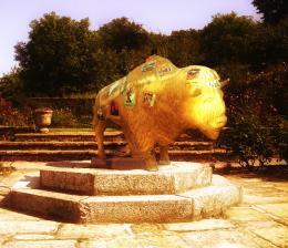 by nasirkhan 5242 views - final score: 52.7% | Life Yet Untouched by Tragedy 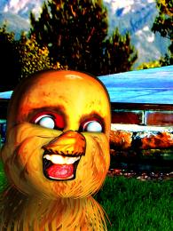 by Drivenslush 6661 views - final score: 52.7% | Interplanetary Bison Souvenir 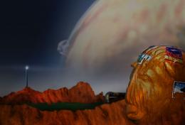 by lchappell 5483 views - final score: 52.4% |
Arbustes  by Lamantine 3196 views - final score: 52.1% | Buffalo Benjamin Grimm 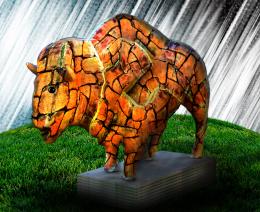 by Drivenslush 5438 views - final score: 51.8% |
Howdie Guest!
You need to be logged in to rate this entry and participate in the contests!
LOGIN HERE or REGISTER FOR FREE
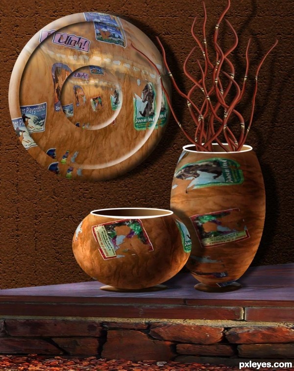
Very nice still life, good composition.
very nice construction, very well done author
Good work except for the oval top of the foreground pot, which should be the same as the one to its right.
Great! It's a beautiful work... But CMYK is right about the mouth of the smaller pot. Its perspective is a bit wrong, unless you make a tilted pot.
Nice idea. I'm not sure either pot mouth matches the perspective of the surface the pots rest on, however, and the bright-white rim rings seem odd for pottery. The base flange of the short pot appears to be farther back than the base flange of the tall pot, yet the body of the short pot (which admittedly looks like it's forward-leaning) is in front of the body of the tall pot. What is keeping the branch thingies from touching the tall pot's rim edge? I personally don't think random distorted/stretched/shrunk travel labels is all that compelling as pottery decoration; consistency would be better. More-feathered edges on the pots with more shading would make them appear less flat. The SSE highlights on the hanging plate are too intense and should be essentially no larger than the NNW shadows IMO.
very original take on the source - great depth
Nice work author. Agree about perspective mismatch of pot upper oval
UPDATE: Thanks for comments and suggestions, you all. Corrected perspective on top of small pot!!!
very nice creation
Yes creative and well done.
very very nice...gl
lovely creation.......
Very nice take on the source, and good perspective fix.
Fantastic! Looks 3D
Howdie stranger!
If you want to rate this picture or participate in this contest, just:
LOGIN HERE or REGISTER FOR FREE