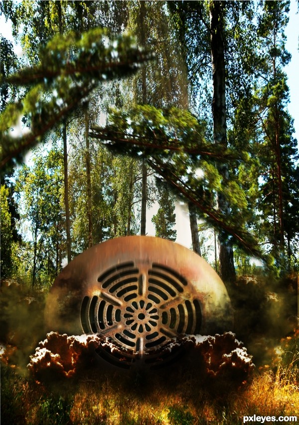
(5 years and 3497 days ago)
Final Preparation's  by erathion 14615 views - final score: 65.5% | Rust Fairy  by CorneliaMladenova 10625 views - final score: 62.2% | Venting  by jadedink 7905 views - final score: 61.6% |
Standing alone!  by shaiju1974 9223 views - final score: 61.2% | Egg Stealing Weasel  by Drivenslush 9947 views - final score: 57.5% | deep deep red?  by kevinice95 4451 views - final score: 55.5% |
Fond Memories Discovered  by pearlie 5385 views - final score: 54.6% | desert  by ja3farstyle 4001 views - final score: 54.4% | Wars Not Make One Great  by Drivenslush 6529 views - final score: 54% |
Colosseum  by itsdesign 4623 views - final score: 52.3% | falling objects 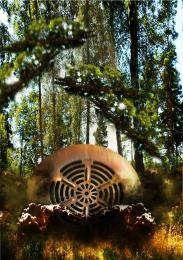 by andi 8291 views - final score: 52% | Silver earring 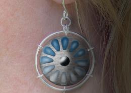 by Disco 4732 views - final score: 51.1% |
Golden vent  by nevena 3708 views - final score: 50.1% | Psychedelic Walk  by woodztockr 20271 views - final score: 48.1% |
Howdie Guest!
You need to be logged in to rate this entry and participate in the contests!
LOGIN HERE or REGISTER FOR FREE
Explosion wouldn't be symmetrical or so opaque, otherwise not bad.
I agree with CMYK46 on the need for 'explosion' asymmetry in order to appear more realistic. I also think some (perhaps around two-thirds) of the foreground grass needs crisp edges in order to create a feeling of depth.
Howdie stranger!
If you want to rate this picture or participate in this contest, just:
LOGIN HERE or REGISTER FOR FREE