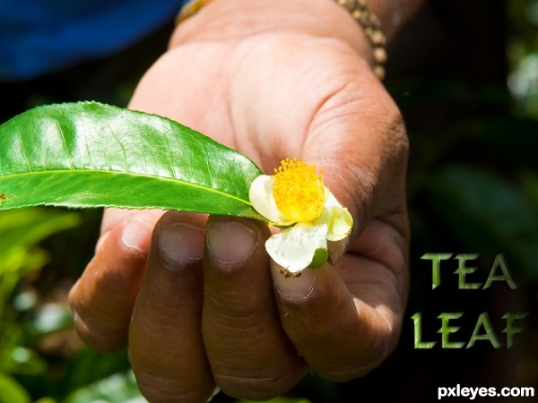
Thanks for the image of leaf and hand by minglespy. (5 years and 3516 days ago)
1 Source:
Toothy, I think he's dancing.  by bompy 11980 views - final score: 62.7% | Leaf & Flower  by lahiripartha 9684 views - final score: 59.1% | source of hope  by trapp2612 9907 views - final score: 56.7% |
Walking on Watery Sunshine 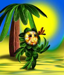 by Drivenslush 10714 views - final score: 56.6% | Forest Fairie 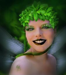 by telmafrancione 7974 views - final score: 56.4% | Tree 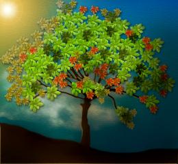 by telmafrancione 3925 views - final score: 56.3% |
fountain  by nonotkrov 6032 views - final score: 53.3% | Green magic 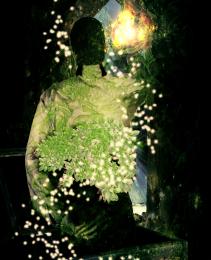 by bingbong088 8425 views - final score: 53.2% | pendant 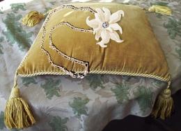 by jayone 4516 views - final score: 52.7% |
Leaves 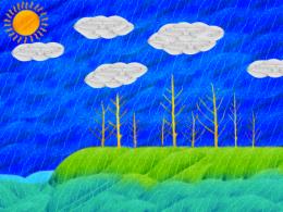 by Melga 4249 views - final score: 51.8% | mother nature 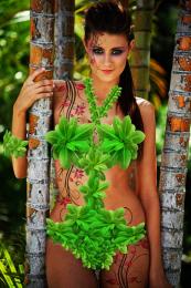 by Glam0urGirl2007 10166 views - final score: 51.6% | dancing leaves  by Glam0urGirl2007 7444 views - final score: 50.4% |
blue eyes  by Glam0urGirl2007 6017 views - final score: 50% | leaves puzzle  by hazem 7973 views - final score: 50% | flower  by jorgechavo7 4634 views - final score: 49.7% |
....makes a nice cup of tea! 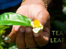 by Disco 10721 views - final score: 48.2% | Abstract  by tushar95in 3891 views - final score: 48.1% |
Howdie Guest!
You need to be logged in to rate this entry and participate in the contests!
LOGIN HERE or REGISTER FOR FREE
Very CBR.
Oh dear, sorry you think that Lamantine, quite a bit of work went into it, and I've seen a LOT worse! (See SBS)
I have to agree with Lamantine!
You only used the source in the text?
...and a 9 step sbs to show it.
i think you could have made the source more relevant to the piece. such as making a background for the hand to be over instead of the original sources background. would have brought more attention to the source image of the contest.
No CMYK46, I also used it for the leaf in the persons hand and used overlay and a few other things - it's all in the sbs. I think jadedink has viewed them, if so - thanks!
Ah jadedink, I used the whole of the background image because it was a tea plantation and that was the whole point of my pic - making the single leaf into a tea leaf. I really don't want to say this: but tea comes from leaves...... THAT'S the point I was making.
my point still is, you can't really SEE the source being used. i mean, i HAD to look at the 9 step sbs just to see if you'd tried to use the source in any other way.
Don't take all of this the wrong way, its just, there are SOOOO many entries in different contests in which the source is minimal, or...barely seen at all. I was just trying to be helpful in suggesting using it in a way which people could see without having to look through 9 steps on how to make a leafy text.
I don't get it...except for being lighter, the leaf is the same as in the source pic.
CKYM46, that's a compliment really although I appreciate that you didn' mean it to be. Well - the leaf is taken from the source image as shown in step 6 of sbs and then I used overlay. So in all the source image is used roughtly nine times in all to create this picture. That's 8 times to make the text and once for the leaf. Now I'm leaving the building!
like the font. good luck Author
It's hard to deny the author's observation that "I've seen a LOT worse!" Nevertheless, this still seems rather slight. Making the text a lot more prominent, and perhaps more of an advertising message instead of just a label, might help.
Seriously, not much use of the source here. I don't need to go to your SBS to see where you used it.
This isn't CBR'd. It's minimal use and you COULD have used more of the source.
Yes, seriously jawshoewhah, you're right!
Howdie stranger!
If you want to rate this picture or participate in this contest, just:
LOGIN HERE or REGISTER FOR FREE