I thank to the stocks:
justmeina and Tigg-stock (the authorization of Tigg-stock is in SBS) (5 years and 3511 days ago)
In the studio  by Naizy 20276 views - final score: 57.8% | Delicious  by telmafrancione 20026 views - final score: 56.5% | A splash of Cocktail  by drodtoni10 44142 views - final score: 54.6% |
black and white 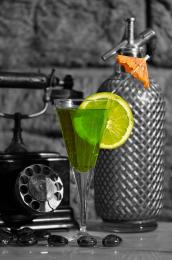 by m4tty22 21263 views - final score: 53.7% | You didn't want one did you? 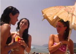 by Disco 25958 views - final score: 51.4% |
Howdie Guest!
You need to be logged in to rate this entry and participate in the contests!
LOGIN HERE or REGISTER FOR FREE
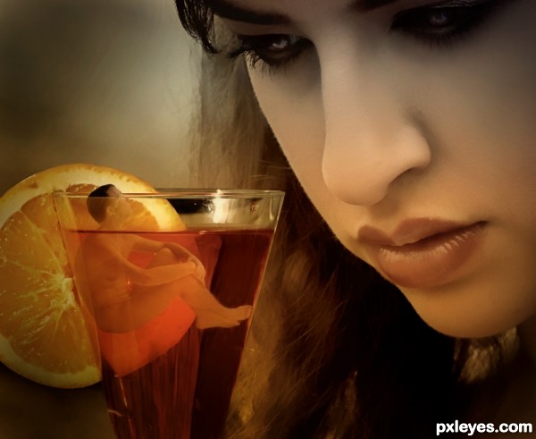
Nice cocktail! I wouldn't drink it though...lol.... Great entry
lol....Thanks a lot Woodztockr.
Thanks for the comment, Nator!
OH please dear lord tell my he took a shower before he got into the drink.. LOLOLOLOL
very cute idea.. good luck author!!!
uahuahuahuahuhauhauha
Drivenslush!!!! Good one!
thanks for the funny comment.
woot! nice one Author, slurp that drink down good luck
Thank you, Cabldawg71.

Interesting idea as Nator noted. I think the guy should be casting some shadow onto the lemon slice, however. And the lighting on the lemon slice doesn't seem to match the lighting on the woman.
DanLundberg.

I thought about the shadows but, the guy and the orange slice are together (inside the glass) so, I think there is no space for the shadow.
I didn't see a problem with the lighting on the orange slice... it is a little bit far from the "spot of light" and it's slightly bright in the part that is closer to the woman and darker when it's far.
Anyway, I thank for your comment, Dan.
There's always space for a shadow; look at any object where it touches the ground (and including that often-miniscule shadow is what helps to make Photoshopping look real). But angle of view could hide a shadow. Although I'm not all that sure that's the case here given the shading on the guy, if you tried a shadow and it didn't look right, I'll defer to your judgment.
great idea and very nice work author...best of luck
DanLundberg,
When I said "there is no space for the shadow", I meant that they are both at the same angle and the guy is touching the orange slice, so he is hiding the shadow and then "no space" to put a shadow.
I tried that before. I had the same point of view as you and before to put the image here I put the shadow there but then it wasn't looking real.
I honestly thank you for the comment ... those kind of conversation make us grow and I've been learning a lot with them.
Erathion,
Thank you for the comment!
IMO this just needs something more...maybe some fart bubbles.
It's a mysterious drink, and she looks very interested in solve that mystery... Nice work!
Nice idea and result, good luck!
CMYK46... arghhhh...lol

Erikuri, thanks and ... I hope she solve the mystery!
Akassa, thanks for the comment!
It's a cocktail... ummm, so where's the "tail?"
Kyricom
hahahahahahahahahahaha
Congrats Telma...
Congrats!
Telminhaaaaaaaaaaa! Congrats!!! Parabéns!!!
Congrats!!
Howdie stranger!
If you want to rate this picture or participate in this contest, just:
LOGIN HERE or REGISTER FOR FREE