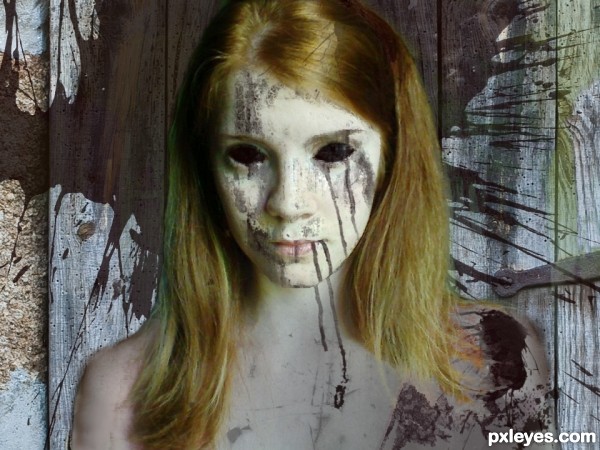
My humble attempt at creating the walking dead. Hope you guys like it!
The sources I used are linked to, other than those it was all brush-work, blending, and color manipulation. (5 years and 3514 days ago)
- 1: Girl Picture
- 2: Door

My humble attempt at creating the walking dead. Hope you guys like it!
The sources I used are linked to, other than those it was all brush-work, blending, and color manipulation. (5 years and 3514 days ago)
mmmm...brains  by jadedink 28224 views - final score: 59.6% | Prom Queen  by jadedink 17119 views - final score: 58.9% | female undead  by Se7eN0f9 15055 views - final score: 57.9% |
Pxleyes Virus 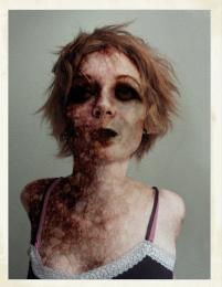 by woodztockr 12744 views - final score: 57.1% | Just behind you...  by erikuri 13794 views - final score: 56.5% | Walking the dead  by Clinge 10055 views - final score: 56% |
zombie waiting  by Glam0urGirl2007 6387 views - final score: 55.8% | No Coffin Needed  by etherealities 8104 views - final score: 55.1% | Beauty Undead  by drodtoni10 9709 views - final score: 54.9% |
zombie freddy  by lolu 6147 views - final score: 54.5% | Join Us  by telmafrancione 6081 views - final score: 53.4% | Bellatrix Lestrange  by Lamantine 5599 views - final score: 52.4% |
A Young Cauldron Born  by Drivenslush 7698 views - final score: 51.9% | This Arm Sucks  by woodztockr 7328 views - final score: 51.6% | Ruptured Heart  by woodztockr 6140 views - final score: 49.6% |
Howdie Guest!
You need to be logged in to rate this entry and participate in the contests!
LOGIN HERE or REGISTER FOR FREE
i love the vibe i get from this picture very creepy :P
Has potential, but it looks more like someone wearing a mask to me because the body doesn't match the face. Hair and shoulder edges lack the crispness of the 'mask' which emphasizes the maskiness of the face.
I see, I see. There were pink sleeves in the original image that I had a lot of trouble covering up. I'm not good at some things in photoshop yet. If anyone has tips on how to cover things like that up more efficiently, I'd love to hear them!!
Why the need to remove the pink sleeves? If you thought they were too cheery for the walking dead, you could select them and change their hue to something more somber. But I think the contrast between frilly and dead would actually enhance the creepiness.
nice work...gl
I thought about leaving them in, but somewhere along the lines of making it I had the idea that bare shoulders would just be creepier. The problem I ran into with them was making the edges I had to erase (that were sticking out past where the natural arm was) look natural and not blurry. Which as you've noted I never did quite accomplish, haha.
I do like the occasional mixing of creepy with "cheery" though, it just wasn't working for me in this one.
I like your work! GL author.
Howdie stranger!
If you want to rate this picture or participate in this contest, just:
LOGIN HERE or REGISTER FOR FREE