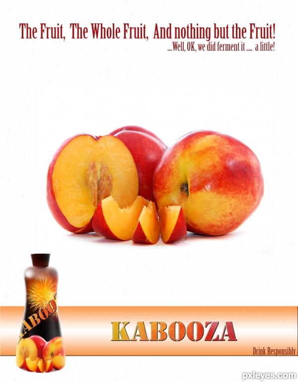
Cut out the peach, added it as main picture as well as clipped onto the bottle along with the fireworks.
Thank you MeiTeng of SXC for the fireworks pixture, and topfer for the nectarines.
Fonts used: Birch standard from photoshop and Army Thin. (5 years and 3509 days ago)


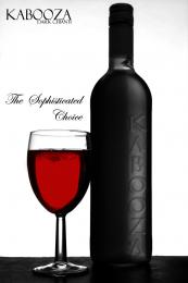
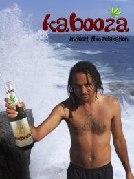
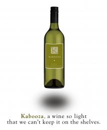
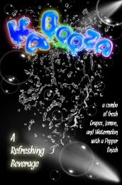
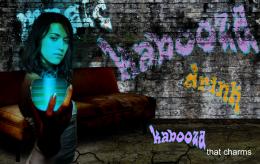
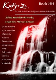


Nice work. You can avoid the drop shadow of the bottle, use only perspective shadow or nothing. I like the fireworks idea used in the bottle.
Simple and appealing with a little word play -- nice! The 'Kabooza' on the bottle does not seem as curved as I would expect the bottle's surface to be, however. There are a lot of shadows from different light sources going on. Just a base shadow on the bottle (as gopankarichal proposed) and no shadow for the big 'Kabooza' might yield a compelling less-is-more spareness.
Thanks for the comments, have removed the shadows and fiddled about with the "Kabooza" on the bottle.
very nice -- I'd expect to see this in print
Sincerely, I'd like another kind of bottle, but the label is very good.

Nice touch for the advice below the drink name!
I like the shape of the bottle it looks very original. the picture of the fruit you chose isn't very appetizing though- try finding one with water droplets on it
Reminds me more of a shampoo bottle but that aside I think you're on the right track... Most of the time you would see 'cut' fruit alongside untouched fruit, and there is normally more than one which, from the feeling of your entry I would think it would benefit from showing... It makes the subject more 'inviting' to try... if you know what I mean... it's late... !
!
Thanks for the comments guys ...
OK so I changed the fruit for JamesD (thanks for the idea) and modified the bottle for JamesD and erikuri and updated the colour scheme to match. Better?
Very cool!
The fruit looks much better now!... a much more polished and inviting ad! one of the best I've seen so far... GL author!
good work
Very nice...i like fruity look,but with bottle like this,looks like a shampoo...
Nice work author, love the colours you used.
Howdie stranger!
If you want to rate this picture or participate in this contest, just:
LOGIN HERE or REGISTER FOR FREE