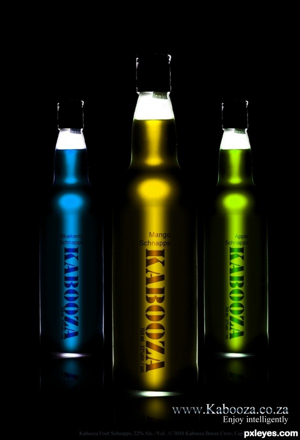
Fonts used: Photoshop's: Stencil; impact and Arial
Thank you to André Banyai of Flickr for his bottle. (5 years and 3503 days ago)
1 Source:
- 1: Bottle
kabooza  by nanaris 8053 views - final score: 58.5% | Official artist's milk  by erathion 12044 views - final score: 57.8% | Kabooza COCO'  by genuine2009 11872 views - final score: 57.8% |
Kabooza Juice 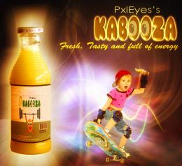 by nasirkhan 8465 views - final score: 57.8% | Disrespect Your Thirst! 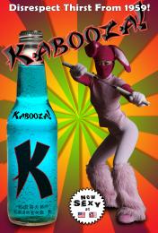 by blindscientist 12130 views - final score: 57.5% | Modern Twist!! 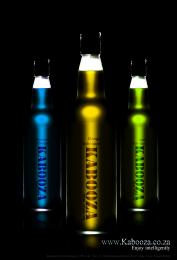 by AngeldustUK 6341 views - final score: 57.4% |
It's Peachy! 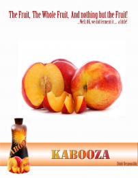 by AngeldustUK 4258 views - final score: 56.9% | The new power drink. 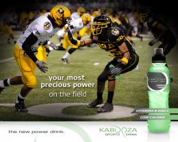 by Ressiv 6011 views - final score: 56.6% | Sophistication 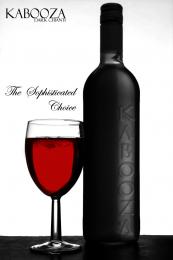 by Geexman 3808 views - final score: 56% |
Beer 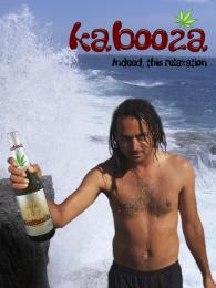 by filantrop 4838 views - final score: 54.1% | Wine 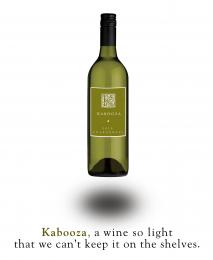 by Nator 4255 views - final score: 53.6% | grape lemon watermelon pepper 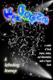 by Drivenslush 7524 views - final score: 52.6% |
That charms 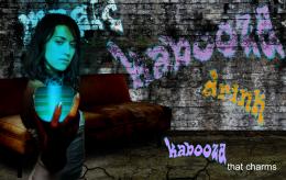 by filantrop 3835 views - final score: 51.6% | Convention Catalog Page 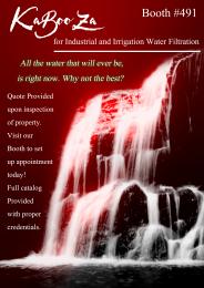 by Drivenslush 7176 views - final score: 49% |
Howdie Guest!
You need to be logged in to rate this entry and participate in the contests!
LOGIN HERE or REGISTER FOR FREE
use a reflection ; ) gives a nicer effect!
An earlier version had some, I forgot to show the layers when saving! Thanks for pointing it out. Have corrected it now.
Dramatic. Maybe too much so as I had a hard time discerning right away that these were bottles. Part of that may be my monitor, but I do notice that your source bottle has more white outlines and larger white base. Since "Schnapps" seems to be centered over the vertical "Kabooza," I think the flavor text should also be centered. I like the inclusion of all the fine print for completeness.
Very chic! Maybe a little bit light background...
Excellent
Good work author! The reflection on the floor can be little more.
superb!
Very cool entry...good luck
Howdie stranger!
If you want to rate this picture or participate in this contest, just:
LOGIN HERE or REGISTER FOR FREE