(5 years and 3482 days ago)
kabooza  by nanaris 8023 views - final score: 58.5% | Official artist's milk  by erathion 11994 views - final score: 57.8% | Kabooza COCO'  by genuine2009 11826 views - final score: 57.8% |
Kabooza Juice 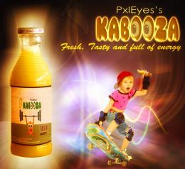 by nasirkhan 8428 views - final score: 57.8% | Disrespect Your Thirst! 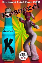 by blindscientist 12084 views - final score: 57.5% | Modern Twist!! 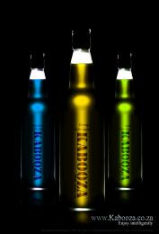 by AngeldustUK 6314 views - final score: 57.4% |
It's Peachy! 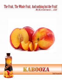 by AngeldustUK 4232 views - final score: 56.9% | The new power drink. 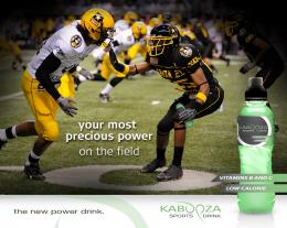 by Ressiv 5970 views - final score: 56.6% | Sophistication 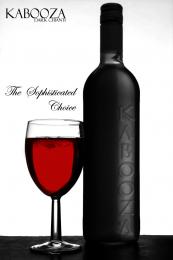 by Geexman 3790 views - final score: 56% |
Beer 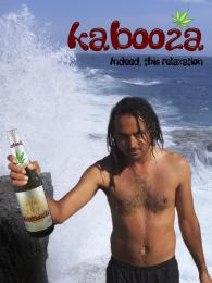 by filantrop 4819 views - final score: 54.1% | Wine 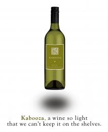 by Nator 4235 views - final score: 53.6% | grape lemon watermelon pepper 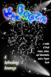 by Drivenslush 7466 views - final score: 52.6% |
That charms 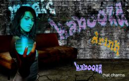 by filantrop 3813 views - final score: 51.6% | Convention Catalog Page 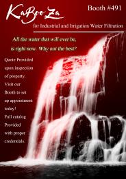 by Drivenslush 7137 views - final score: 49% |
Howdie Guest!
You need to be logged in to rate this entry and participate in the contests!
LOGIN HERE or REGISTER FOR FREE
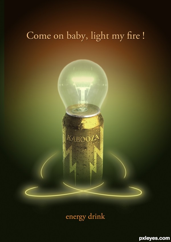
Creative idea to depict 'energy' with the 'drink.' "Kabooza" does not match the curve and perspective of the can. The bulb's perspective doesn't match the can's either, alhough that discrepancy is less noticeable. If the arcs are an allusion to atomic energy, I think brighter arcs with more plausible orbital paths circling the body of the can would be more compelling. I think the headline is a bit misleading as there is neither a baby nor fire in the image. Dropping the headline would yield a dramatic, understated (epitomized by the all-lower-case "energy drink" , and effective (IMO) message.
I think there are a few things that I would look at improving...

1: The 'Kabooza' on the can needs to wrap around the can
2. The can and overall presentation would come across better if it had a bottom, with a mirror finish reflection.
not entirely convinced about the lightbulb or the title text but it's your vision so...
Yep, wrap the type & give the can a bottom.
It's cool! But I agree with the type and the bottom.
Good work, nice color scheme. Correct the logo issues.
nice
thank you all for your comments and advice ive made a few changes
With this bulb u could use this slogan "the best energy drink in the world,with kabooza ,even nerds get some"... ...again just a joke author,i like your idea and execution...best of luck
yes, hi hi, with the slogan i had little problem becouse i dont know very well english so i think :the doors: my favorite band..... so erathion you are right
Lovely work - congrats!
Congrats for your first place, Nanaris!
Congrats!!
Congrats! for 1st
congrats,....very nice design......
Congrats!!
Congrats
Congrats

thanku all!
Congrats for your 1st place
Congrats!!!!
Congrats for 1st place. Excellent !!
Congrats!!
Howdie stranger!
If you want to rate this picture or participate in this contest, just:
LOGIN HERE or REGISTER FOR FREE